

A safari camp asks a guest to send a large sum of money to a place they have never seen, run by people they have never met. Good safari camp branding earns that trust before the guest writes a single email. The colours, the type, the photographs, the copy and the button at the end all have to tell the guest the same thing about the camp.
Mara Velour is a 12-tent camp brand and five-page website I created and directed, set on a Maasai-owned conservancy in Kenya’s northern Mara. I made every decision on it, from the guest it is for to the last line of code. This article walks through those decisions in the order I made them, so if you run a camp or lodge, or plan to open one, you can use the same order for yours.
One guest, and her fears
I started with a person. My brand notes describe her as “A traveller who can go anywhere and has often been on safari before.” She is part of a couple, a family or a small group of friends, often from the UK, the US or Europe. For many, it is one big trip, such as an anniversary, and a lot of them book through a travel agent.
My notes put what she wants in one line: “privacy at the sightings, a guide who knows them by the second morning, and a tent that feels like a home they did not have to pack.”

Then I wrote down what she is afraid of:
- She pays a lot, then queues with 20 vehicles round one lion.
- The camp feels like a hotel, and nobody learns her name.
- She gets the month or the flights wrong.
- She sends her dates and hears nothing for days.
Every page answers one of those fears. Before any design, I wrote the camp in one sentence: “A 12-tent camp on a Maasai-owned conservancy in the northern Mara, where no more than five vehicles may stop at a sighting and your guide stays as long as the animal does.” Each choice after that had to support it.
Safari camp branding from the photos
A safari camp sells what a guest will see. So I built the colours from the imagery, instead of choosing them first and forcing the photos to fit.
I sampled every colour from the camp photographs. There are eight, and each has one job:
- Linen, the main background.
- Canvas, for quieter sections.
- Acacia, the brand colour, for the footer and large blocks.
- Dusk, for the nights.
- Ember, a burnt orange kept for booking.
- Savanna, for numbers and small details.
- Jade, from the pool water, used rarely.
- Umber, for text, so nothing is ever pure black.

I also planned how much of each colour a page should use. Linen covers about half, Acacia and Canvas take most of the rest, and Ember stays at about five per cent. Kept that small, the orange works as a signal. When a guest sees it, they know they can book.
For type, I chose two typefaces that contrast. Headings are set in Helvetica Neue in a thin weight, with one phrase one or two steps heavier, as in “Who looks after you”. The body text is Old Standard TT, a typeface in the style of nineteenth-century printed books, so long paragraphs read like a travel journal. Sizes come from a 16-step scale that grows and shrinks with the screen, so a heading keeps its place in the order on a phone and on a 27-inch screen.

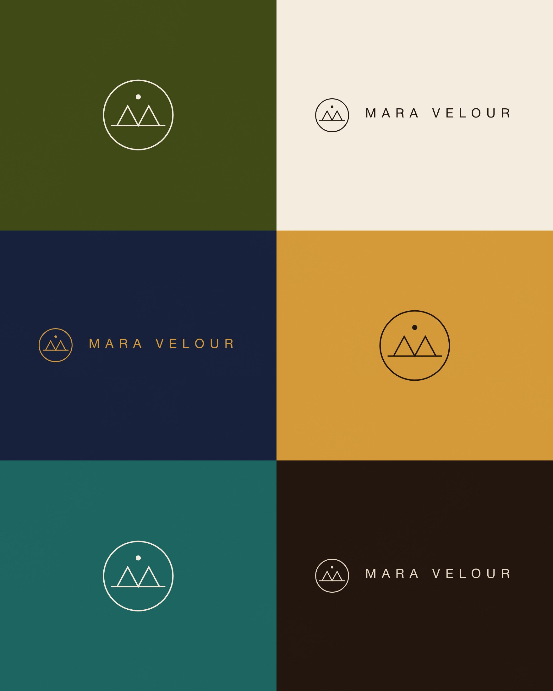
The mark is a circle for the sun at the edge of the plains, a horizon line and two tent peaks. Together the peaks make an M, and the dip between them makes a V. A small dot above is the first star after sunset. I set rules for it from the start: clear space equal to the height of the circle, and never stretched, outlined, boxed or given a shadow.
The patterns come from the place. A band of square beads, based on the beadwork of the Mara, sits under the hero and above the footer, never more than twice on a page. A thin line of tent peaks repeats on dark sections. Fine grass lines run along the bottom of long text sections at low strength, and a soft woven texture, taken from the tent walls, sits on Canvas.
The page plan, in guest order
The site has five pages: Home, The Tents, Food & Drink, The Camp and Plan Your Stay. The home page answers the guest’s questions in the order she asks them, and ends at the enquiry form.
- The first screen names the place and the difference, with a booking bar for dates and guests.
- The arrival shows the first morning, from the plane to the deck.
- “No more than five vehicles” answers the crowd fear with a rule, an aerial photo and four numbers.
- The tents, then “A five-night stay”, one day at a time.
- “The animals here”, then “Who looks after you”, with four named people.
- “Evenings by the fire”, then the enquiry.

The four numbers sit large on Acacia green, and each one comes with its meaning for the guest. Twelve tents means the team learns your name quickly. Five vehicles is the most allowed at a sighting. Each guest bed has 350 acres of open land, and the 45-minute flight from Nairobi puts you on a drive the same afternoon.
The inner pages go deeper. The Tents gives each tent type its own fact list. Food & Drink names the chef and the times of each meal. The Camp covers the pool, the lounge, spa and yoga, and the walk back at night. Plan Your Stay has the seasons, the flight on a drawn map and the questions guests ask before booking, from rates to entry to Kenya.
Photography with rules to follow
A set of photos that tells one story across five pages needs rules. I set these before a single image was made.
The light is golden hour, firelight or blue dusk, and never flat midday. Faces are never cut by the frame or covered by text, and animals get space in the direction they move. Every gallery mixes a view, an animal, a person, a detail and a meal, and no photo appears twice on a page.
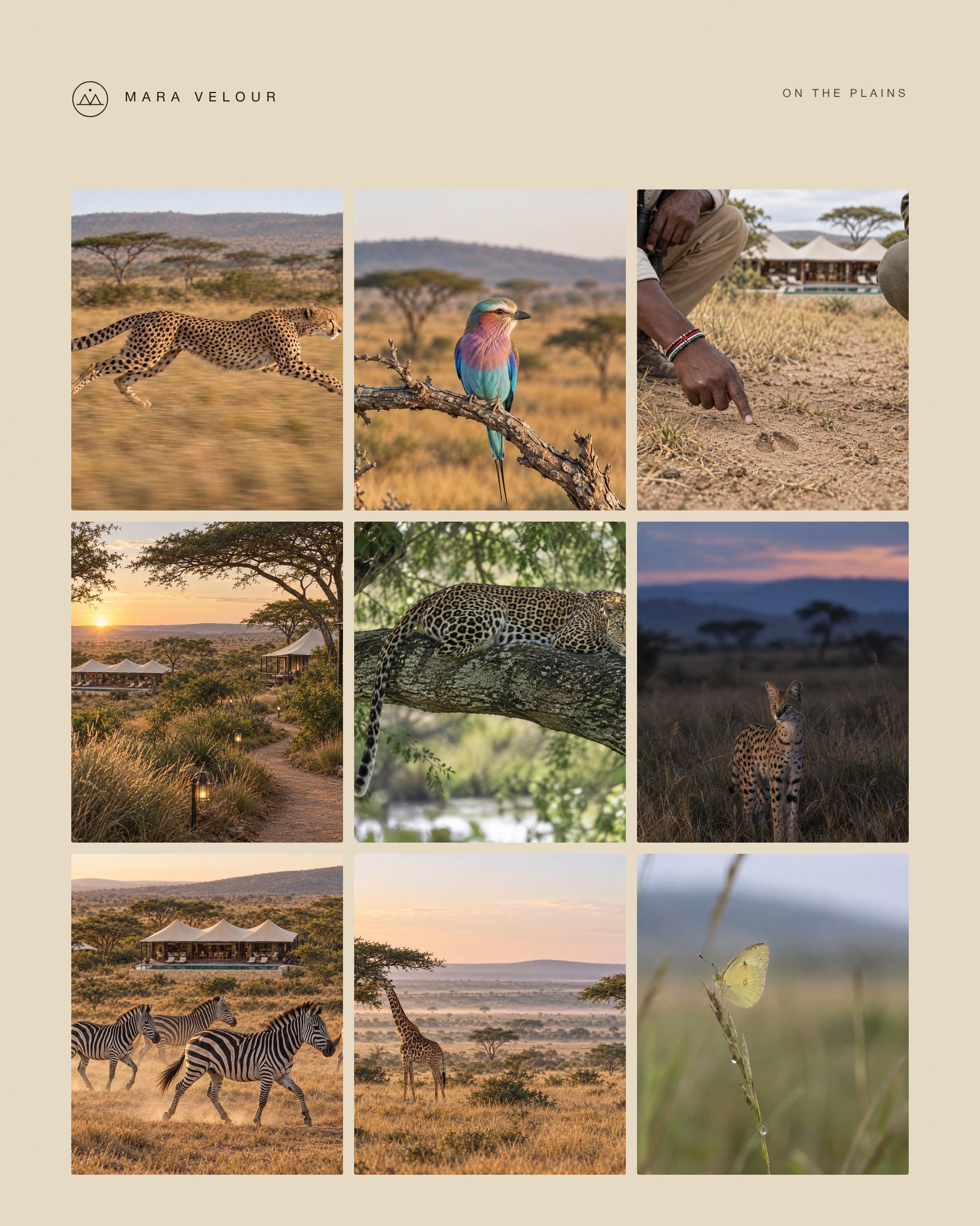
The light follows the day on the site too. The home page opens on the main tent at dusk, moves through the morning arrival and the day’s drives, and ends by the fire under a blue night sky. When the guest reaches “Evenings by the fire”, the background turns from Linen to Dusk blue as they scroll.
Copy with times and names
The voice I set for the camp is “Quiet, warm and exact, like a good host walking you to your tent.” In practice that means plain words about what the guest will see and do, with a time, a weight, a distance or a name wherever one fits.
On the site, your first coffee comes to your deck at 5.45 am. Soft bags can weigh up to 15 kg each. The nearest tent is about 60 metres away, so nobody can see in. Lemayian, the head guide, meets the plane.
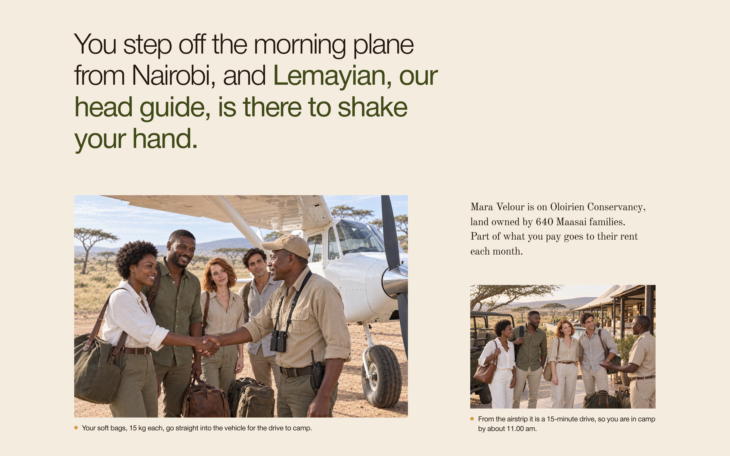
Hotel words such as “unforgettable” and “breathtaking” stayed out, and so did reviews and awards the camp does not have. The captions carry facts too, each marked with a small gold pin. By the pool, one reads “The pool is not heated. By 2.00 pm on a hot day, you will be glad.”
By day two, nobody asks how you like your eggs.
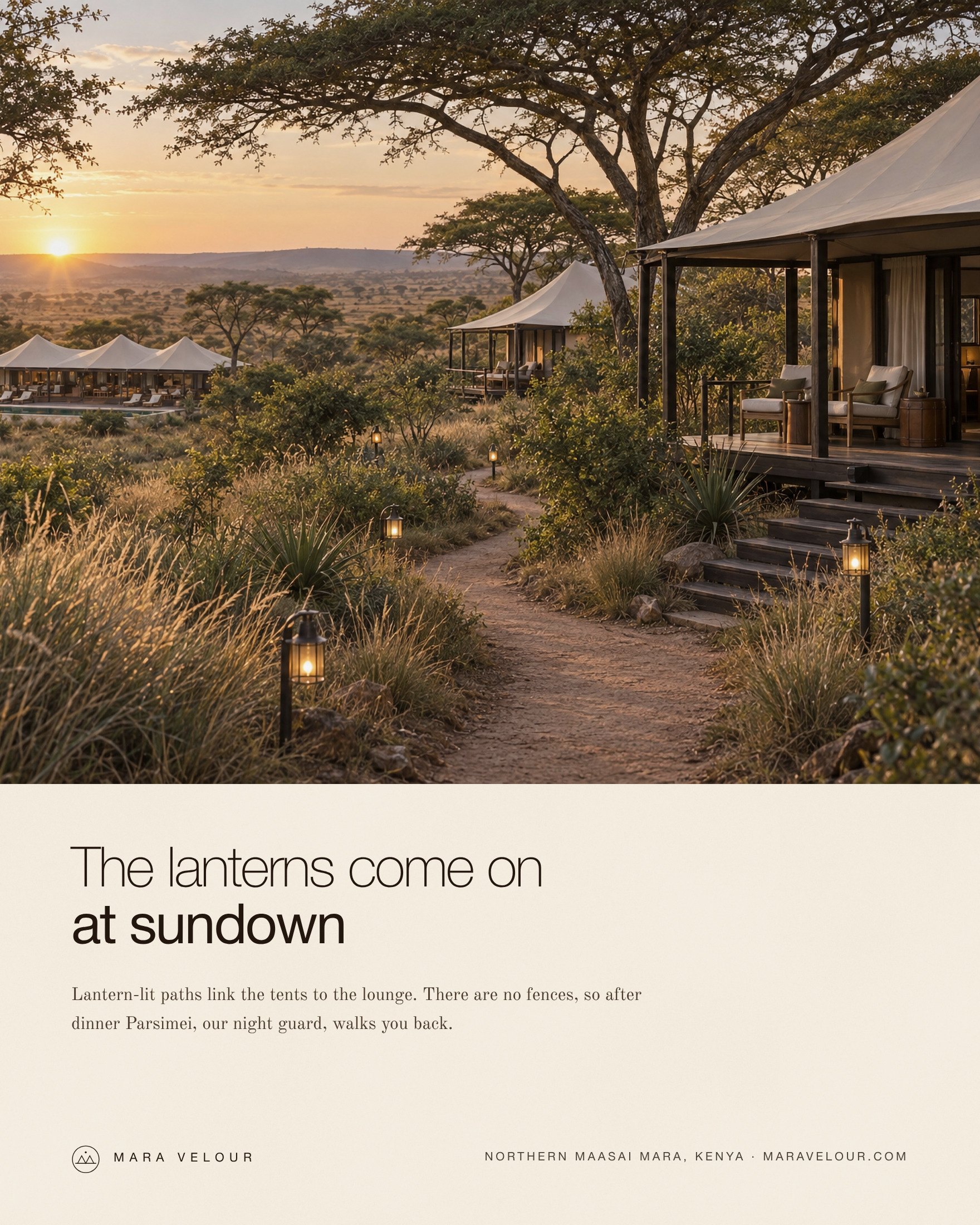
The same voice works off the screen. In the print advert, the line “The lanterns come on at sundown” sits over a short paragraph about Parsimei, the night guard who walks guests back after dinner.
One path to the booking
A guest who is ready should never have to look for the next step. There is one button label on the whole site, “Check dates”, always in Ember, on every page.

Dates picked in the booking bar on the first screen are copied down to the form, so nobody types them twice. The enquiry then sets out what happens. You send your dates. Within 24 hours, Achieng, the camp manager, emails which tents are open and a first plan for your stay. If you like the plan, a deposit holds your tents.
Under the form, one line says that sending dates costs nothing and books nothing, and another tells travel agents they can send dates for their clients on the same form. After sending, the thank-you message repeats the dates back and says again that nothing is booked yet.
Plan Your Stay adds what a guest needs before she pays a deposit: a “from” price for each season, what the rate includes, what costs extra, the deposit and the cancellation terms.
Built by hand and tested
I built the five pages by hand in HTML, CSS and JavaScript, with motion that follows the scroll. The headings rise into place as they come into view. The aerial photo opens out as the guest reads down the page. On a computer, the row of day cards in “A five-night stay” moves sideways while the section stays in place, with a bar that shows how far you have read. On Plan Your Stay, the flight route draws itself and a small plane moves along it.
On a phone, the guest swipes through the day cards, and every food and kitchen photo has its caption under it instead of on top. If a guest’s phone or computer is set to reduce motion, everything shows at once without animation. I checked each page on phones, tablets, laptops and large screens before calling it done.
You can see every page in the Mara Velour case study. For how other camps compare, read what the best safari lodge websites get right.
The same order for your camp
The order works for any camp, lodge or boutique hotel:
- Write down one guest, what she wants and what she is afraid of.
- Write the camp in one sentence, and test every choice against it.
- Take your colours from your best photographs, and give each colour one job.
- Choose type for headings and type for reading, and set a scale.
- Plan the pages in the order your guest asks her questions.
- Set rules for your photographs before you choose them.
- Give your copy times, distances and names, and cut the words many lodges use.
- Use one button label, and say what happens after the enquiry.
- Test every page on phones, tablets and large screens.
For more, read about intimate luxury, safari camp website design and art direction.
Short answers on Mara Velour
What is Mara Velour?
Mara Velour is a 12-tent safari camp brand and five-page website I created and directed, set on a Maasai-owned conservancy in Kenya’s northern Mara. I did the strategy, brand identity, copywriting, art direction, design and build. The case study is at alansuccess.com/work/mara-velour.
How do you choose colours for a safari camp brand?
Take them from the camp’s best photographs, then give each colour one job. On Mara Velour, eight colours came from the photos, with Linen as the main background, Acacia green for large blocks, Dusk blue for the nights and Ember, a burnt orange, kept for booking.
Which fonts suit a luxury safari camp website?
A pair that does two jobs well. Mara Velour uses Helvetica Neue in a thin weight for headings, with one phrase heavier, and Old Standard TT for reading, which feels like a printed travel journal. The right pair depends on the camp’s character.
What pages does a safari camp website need?
Five pages cover what a guest needs before booking: a home page, the rooms or tents, food and drink, the camp itself, and a page to plan the stay with seasons, travel, prices and the enquiry. A larger lodge may add pages for activities, conservation or travel agents.
How long does a safari camp website take to build?
A custom website like Mara Velour, made from scratch, is quoted after a short brief. A website of up to 5 pages from my packages takes about a week, and larger sites take longer. Work starts once your notes, logo, photos and the deposit are in.

