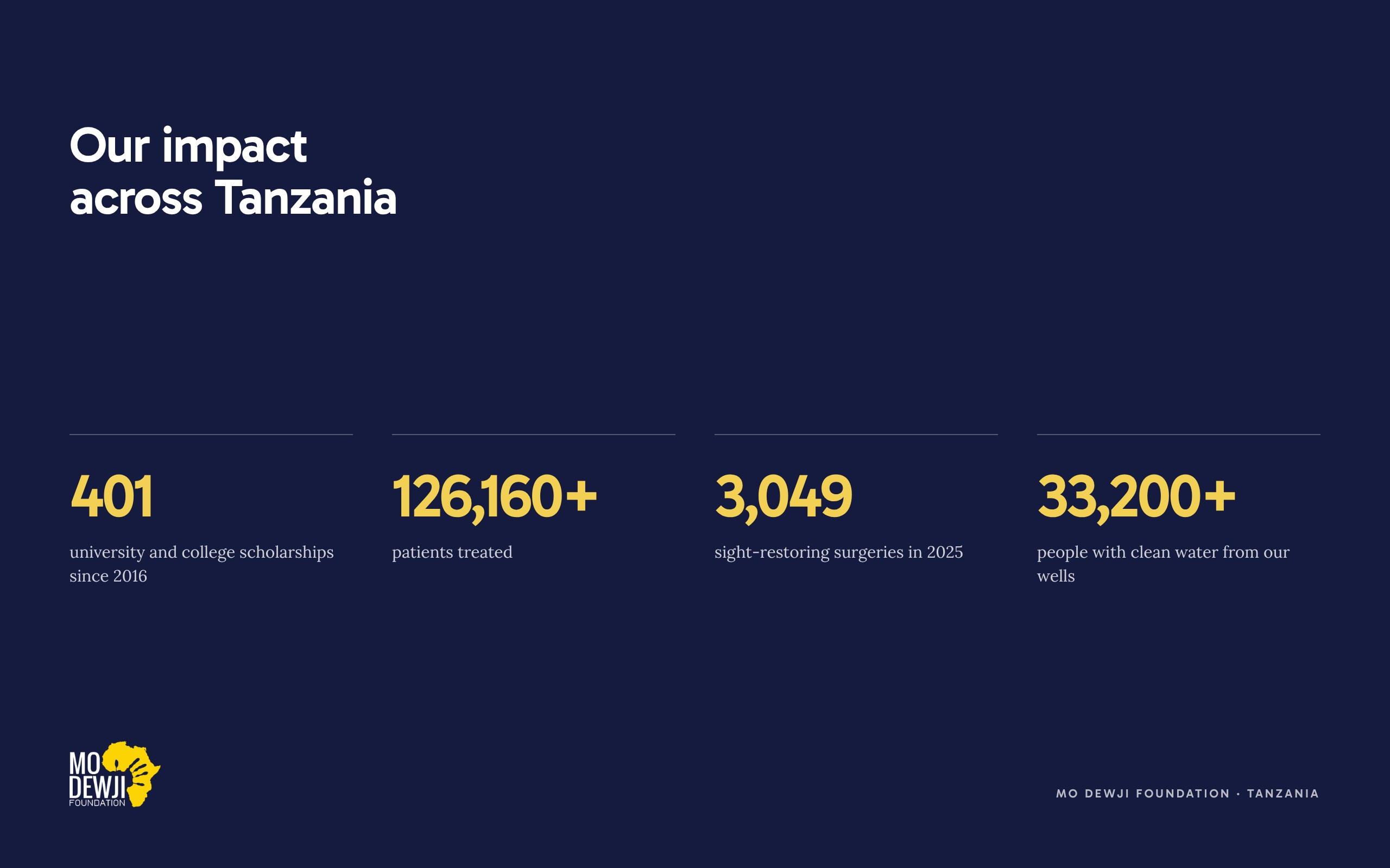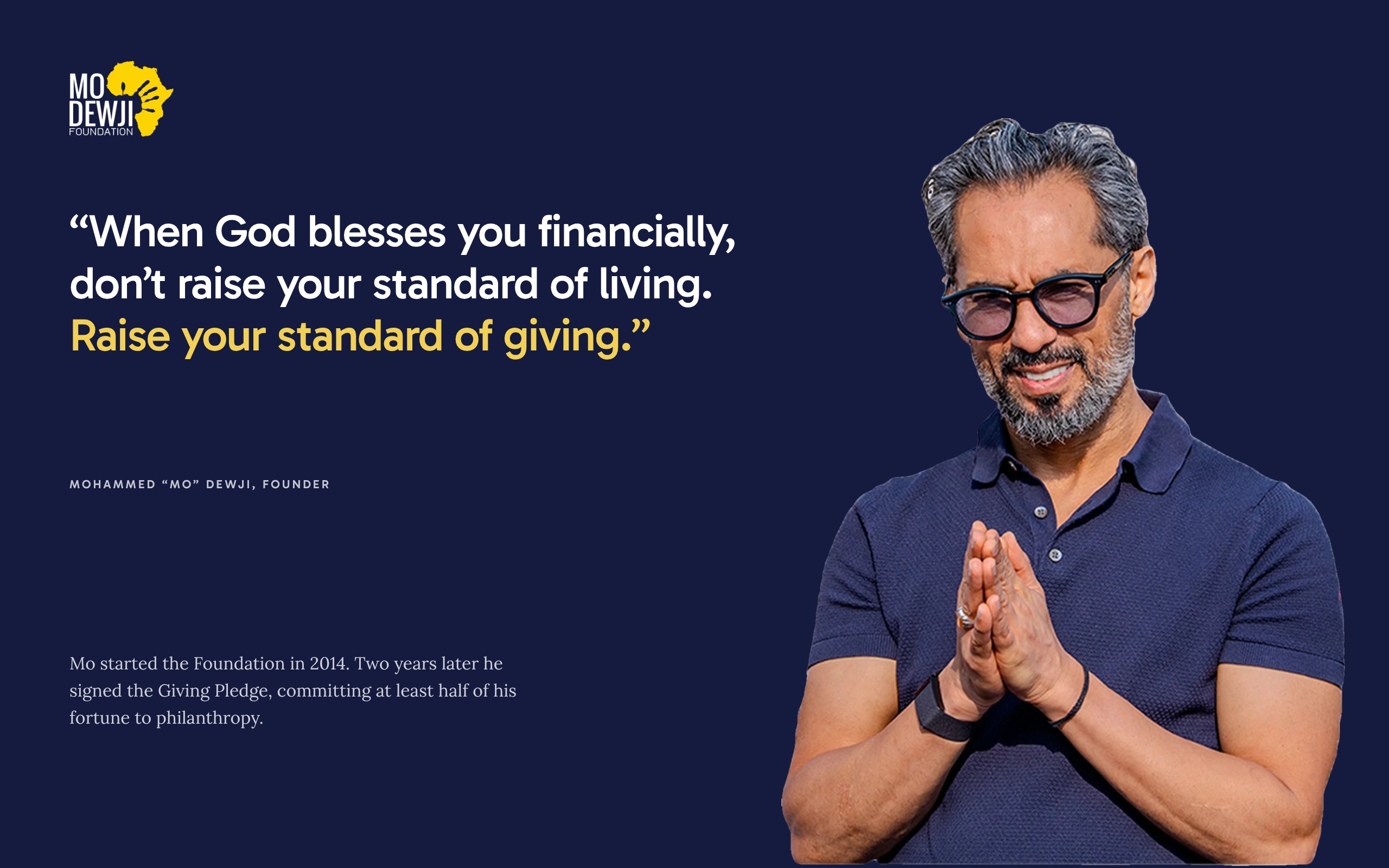

If you run communications for an NGO, a foundation or a company’s CSR programme in Tanzania, your NGO website has very different visitors on the same day. A funder in London or Nairobi is checking your results before a meeting. A journalist needs your latest figure and the year it covers. A parent in Mtwara wants to know if your eye camp will reach her district, and a student wants to know how to apply for your scholarship.
Each of them decides within a few minutes whether to trust you and whether to act. When the page answers their question, the funder asks for a proposal, the journalist quotes you correctly and the family finds the help. When it does not, they close the tab and you never hear from them.
Below is what I plan into every foundation website, where the best NGO websites in Africa and around the world already get it right, and how the homepage redesign I proposed for the Mo Dewji Foundation in Dar es Salaam puts each point on the page.
Say what you do in one line
The first screen should name the work and the place in a sentence a stranger could repeat to a colleague. The strongest NGO websites keep that sentence plain. GiveDirectly opens with “Send money directly to people who need it most.” charity: water opens with “Bring clean and safe water to every person on the planet”.
Twaweza, an East African organisation, explains its own name on its homepage. Twaweza means “we can make it happen” in Swahili, and the next sentence says what the organisation works on and names its three countries, Tanzania, Kenya and Uganda.
The Mo Dewji Foundation’s homepage opens with its line “Inspiring change, one life at a time”, which is also on the cover of its 2025 Impact Report. The three programmes are named in the section after it. In the redesign I proposed, the only h1 on the page names all three on the first screen: “Putting university, eye care and clean water within reach of every Tanzanian.”
Write your own line with three facts in it: the work, the people it serves and the place. Your motto can come later on the page.
Show each result with its label
A funder who reads a figure asks what it counts, which years it covers and where to check it. A number without those answers is hard to repeat in a board paper.
Good NGO websites put the answer next to the number. The Mastercard Foundation’s homepage labels one figure “Youth-in-Work since 2017”, so the start year is part of the label. GiveDirectly puts the number of academic studies on its programmes beside a link to the research. The Tony Elumelu Foundation writes its result as a sentence: since 2015 it has funded more than 27,000 young Africans with seed capital of $5,000 each.
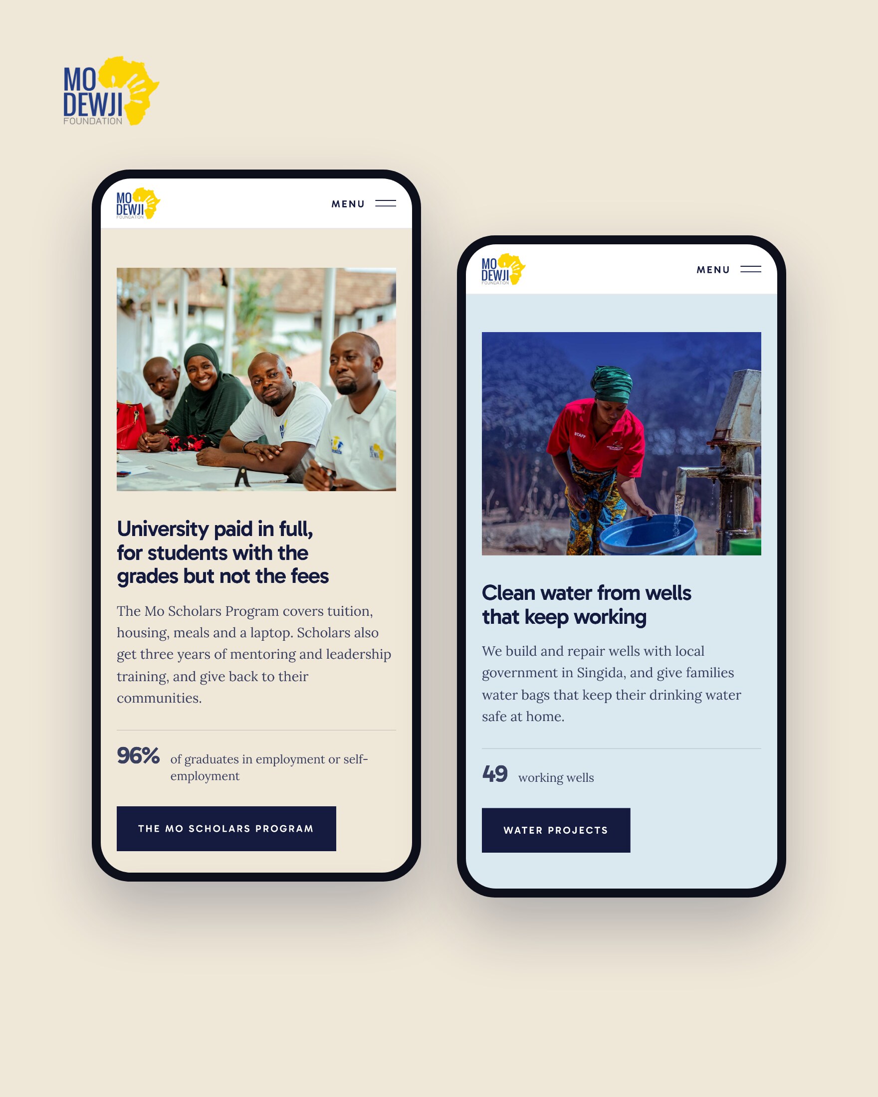
For the Mo Dewji Foundation, the Mo Scholars Program page gives a 96% post-graduation success rate and says it is measured “in employment and self-employment”. In the redesign I proposed, each programme has its own band, with one figure beside the text about that programme. The education band reads “96% of graduates in employment or self-employment”. The health band carries the 87% surgery success rate, which the 2025 Impact Report sets against the World Health Organization (WHO) benchmark of 80%.
Labels, years and sources each get a section of their own in how to show impact numbers people believe.

Show where you work on a map
A family wants to know if the work reaches their region. A funder wants to see how far the money goes. A map with the places named answers both, and a list beside it says what happens in each place.
The Mo Dewji Foundation’s 2024 Impact Report places its 49 wells in Singida, Morogoro and Tanga. The 2025 report counts 20 integrated health camps over two years.
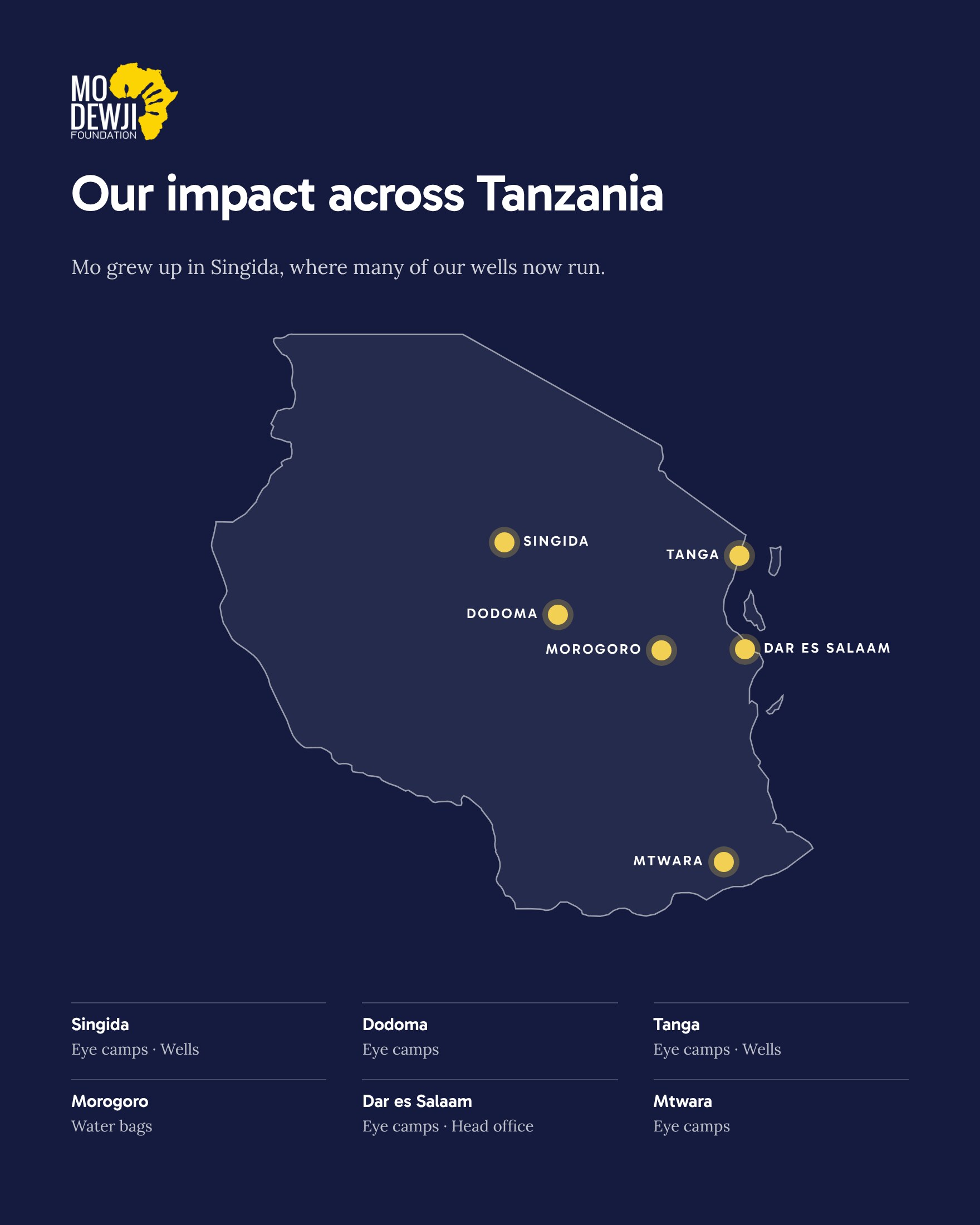
In the redesign I proposed, “Our impact across Tanzania” pins six regions on a map: Singida, Dodoma, Tanga, Morogoro, Dar es Salaam and Mtwara. Each region is listed beside the map with the work done there, such as eye camps, wells or water bags. On a phone, the list comes before the map, so the place names are read first.
Keep reports and news one click away
Journalists and programme officers come for documents. They want your latest annual report, recent news with dates, and figures they can quote. If they have to search, they may email you and wait, or quote an older figure they found somewhere else.
Against Malaria Foundation lists its bed net distributions on its website and says it adds photos and video of each one. charity: water lists See Our Financials next to its 100% Model link, and the Tony Elumelu Foundation keeps its impact reports together on one page.
The Mo Dewji Foundation already publishes a lot. Its publications page holds the 2024 and 2025 impact reports, and its homepage shows three recent articles under Latest News. The redesign I proposed keeps the news and adds a thin banner at the very top, “Our 2025 Impact Report is now online”, with a Read It button. In the news section, each article shows its topic and date, such as Healthcare or Water.

Name your partners and your rules
Before a company or a trust puts its name next to yours, it checks who already works with you and how you handle money. Put partner names where people can read them, and keep your policies one click from every page.
charity: water gives its funding model a page of its own: private donors pay its operating costs, so public donations go to water projects. The Mo Dewji Foundation has a similar arrangement. MeTL Group’s page on the foundation says MeTL covers all of the foundation’s administrative costs, so that 100% of proceeds go to its programmes. If someone else pays your running costs, say so in a sentence like that on your own About page, where a funder will look for it.
The foundation’s website already links to its whistleblower policy, its zero tolerance for corruption policy and its privacy and cookie policies. The redesign I proposed keeps all four in the footer, and gives the partners a section of their own, “Our partners in Tanzania and around the world”, with 24 logos, among them Muhimbili National Hospital, Tumaini La Maisha and King’s Trust International. The logos stay grey until you point at one, so the foundation’s own blue and yellow stay the main colours on the page.

Give each visitor a next step
Each kind of visitor needs a button that names what happens next. A single Donate button leaves the student and the volunteer with nowhere to go.
GiveDirectly offers a monthly gift beside its Give now button, and a separate Major gifts link for larger donors. The Mastercard Foundation gives its Scholars Program its own page, and its website has separate pages for partners, careers and press.
In the redesign I proposed, the section “Help us reach the next family” has three tiles. Partners can fund a scholarship, an eye camp or a well, and their button reads Become a Partner. Students see who can apply, Tanzanian students aged 18 to 25 starting university, with a See How to Apply button. The third tile is for volunteers and job seekers, with Get Involved. Partner With Us also stays in the menu at the top of the page.
For students, the dates come first. The Mo Scholars Program page gave the application window for the 2026/27 intake as 21 September to 8 October 2026. While applications are open, a date like that belongs on the homepage.

Make it quick on a phone
More than two thirds of web page views in Tanzania come from mobile phones. In October 2026 the figure was 69%, on the websites StatCounter tracks. On mobile data, a heavy page costs the visitor time and money before they read a word.
Size photos for the screen while keeping them sharp, leave out loading screens and heavy effects, and test the page on a slow connection.
I checked the Mo Dewji Foundation redesign on a small phone screen, and nothing scrolls sideways. On a phone the banner shortens, the menu becomes one button, the main figure comes first and the sections stack in the same order as on a laptop. The menu also carries an EN / SW switch, ready for a Swahili version of the page.
Check your own NGO website
Open your homepage on your phone, on mobile data, and go through this list.
- The first screen names your work, the people it serves and the place, in one sentence.
- Every figure has a label that says what it counts, and a year or a span of years.
- Each programme has one result, placed beside the text about that programme.
- Your regions are named, and a visitor can see what you do in each one.
- Your latest annual report is one click from the homepage.
- News articles show a date and a topic.
- Partners are named, and your policies are linked in the footer.
- Partners, people applying for help and volunteers each have their own button.
- Application dates are on the homepage while applications are open.
- The page loads quickly on mobile data, and nothing scrolls sideways.
- If the communities you serve read Swahili, the main pages are in Swahili too.
To see every point on one real page, read the redesign I proposed for the Mo Dewji Foundation, section by section.
Short answers for NGOs
What should an NGO website in Tanzania include?
One sentence that says what you do and where, your main results with what each figure counts and its year, the regions you work in, your latest report, recent news and your partners. Then a clear next step for funders, for people applying for help and for volunteers, with your policies linked in the footer.
How do we make funders trust our website?
Give each figure its label, its year and its source, and keep the annual report one click away. Name your partners and link your policies on corruption and whistleblowing. Use real names and places from your programmes, with permission.
Should an NGO website be in English and Swahili?
If the people you serve in Tanzania read Swahili, yes. Many funders and international partners read English, so a language switch at the top lets each visitor choose. Start with the pages families use most, such as how to apply or where the next camp is.
How long does an NGO website take to build?
A website of up to 5 pages usually takes about a week, up to 10 pages one to two weeks, and up to 20 pages about two weeks. The time starts once your notes, logo, photos and the deposit are in.
Can our team update the website after it goes live?
Yes. The websites I build are on WordPress and set up in your organisation’s name. At handover you get a short video showing the everyday edits on your own site, such as adding a news article or a new report.