
The Mo Dewji Foundation (MDF) funds university places, eye care and clean water across Tanzania. The Mo Dewji Foundation website, modewjifoundation.org, is where funders, partners, journalists and students go to check what it does and how to take part. This article goes through the foundation’s work, its homepage today and a homepage redesign I proposed for it, section by section.
The best foundation websites in the world do a few things well. They say what the foundation does in one sentence, put each result beside the words that say what it counts, show where the work happens and give every visitor a clear next step. The redesign I proposed does all of this with the foundation’s own logo, colours, photos, figures and quotes.
If you lead communications for a foundation, an NGO or a company’s CSR programme, you can test your own homepage against the same order. The redesign is online as a preview at foundation.theascend.net, and the case study sets out the design decisions.
What the Mo Dewji Foundation does
Mohammed Dewji, known as Mo, founded the Mo Dewji Foundation in 2014. MeTL Group’s page on the foundation describes it as a registered charitable organisation founded by MeTL Group’s CEO, and says MeTL Group covers all of the foundation’s administrative costs, so that 100% of proceeds go to its programmes.
Its mission, in its 2024 Impact Report, is “to improve the lives of Tanzanians with access to higher education, accessible health care and clean, safe water.”
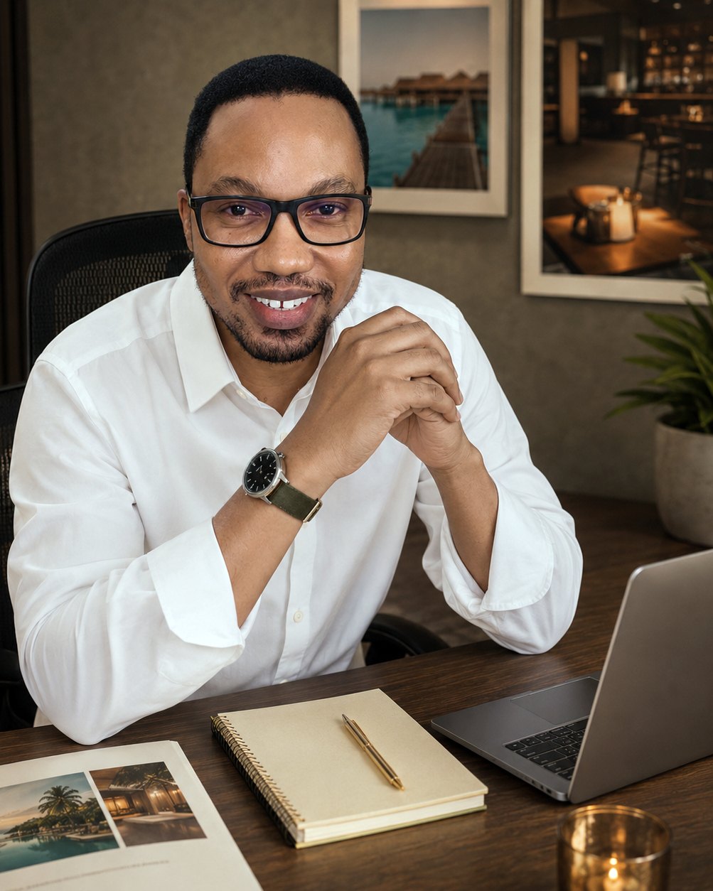
Mo Dewji grew up in Singida, as he writes in the 2025 Impact Report, and he started the foundation after a decade as a member of parliament for Singida. He signed the Giving Pledge in 2016. In May 2026 the foundation announced that he had been named on the TIME100 Philanthropy 2026 list.
The foundation’s three programmes
- Education. The Mo Scholars Program began in 2016 and has awarded over 400 university and college scholarships. It covers full tuition, accommodation, meals and a laptop, with mentoring, for Tanzanians aged 18 to 25 starting university. The Mo-Kerry Scholarship Program, run with Kerry Group, adds one year of training in food science and technology.
- Healthcare. Eye care camps bring screening, cataract surgery, glasses and medicine to communities across Tanzania. The programme also covers cancer care and women’s health, and care for children born with spina bifida and hydrocephalus.
- Water. The foundation runs wells and works with water authorities and local government. In Ifakara, in Morogoro region, it has piloted the SaWa Bag, which treats and stores drinking water at home.
The 2025 Impact Report counts 401 scholarships awarded. In 2025 the eye camps treated 49,041 patients and performed 3,049 eye surgeries, with a surgical success rate of 87%, above the World Health Organization (WHO) benchmark of 80%. The foundation operates 49 wells, and 33,200 people had water access through its water work in 2025.
What the best foundations get right
A foundation homepage is read by four groups, and each arrives with its own question. Partners and funders want results with dates, partner names and the annual report. Students and families want to know if they qualify and how to apply. Journalists want the founder, the year the work began and the latest figures. Volunteers and job seekers want a way to give their time or find a role.
The strongest foundation websites answer each group on the homepage. charity: water explains under each homepage figure what it counts. The Mastercard Foundation writes the start year into a label, “Youth-in-Work since 2017”. GiveDirectly shows its number of academic studies beside a link to the research, and offers a separate link for major gifts.
I planned every section of the redesign around one of those questions, in the order a visitor asks them. The same plan works for any NGO, and I go through it point by point in NGO website design in Tanzania that people trust.
The Mo Dewji Foundation website today
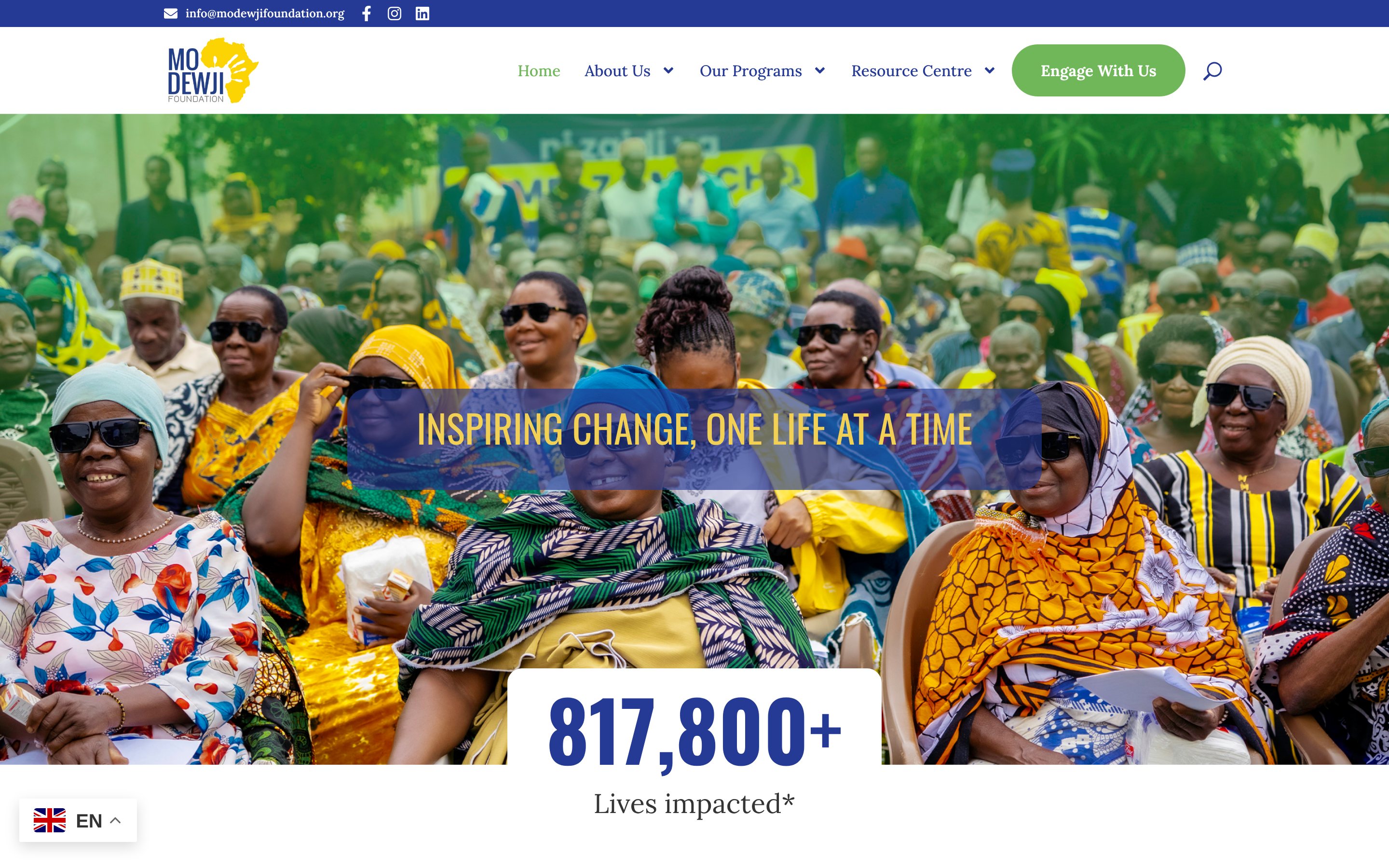
On a laptop in November 2026, the homepage at modewjifoundation.org reads from top to bottom like this.
- A full-width photo slider with the line “Inspiring change, one life at a time”, and 817,800+ lives impacted under it.
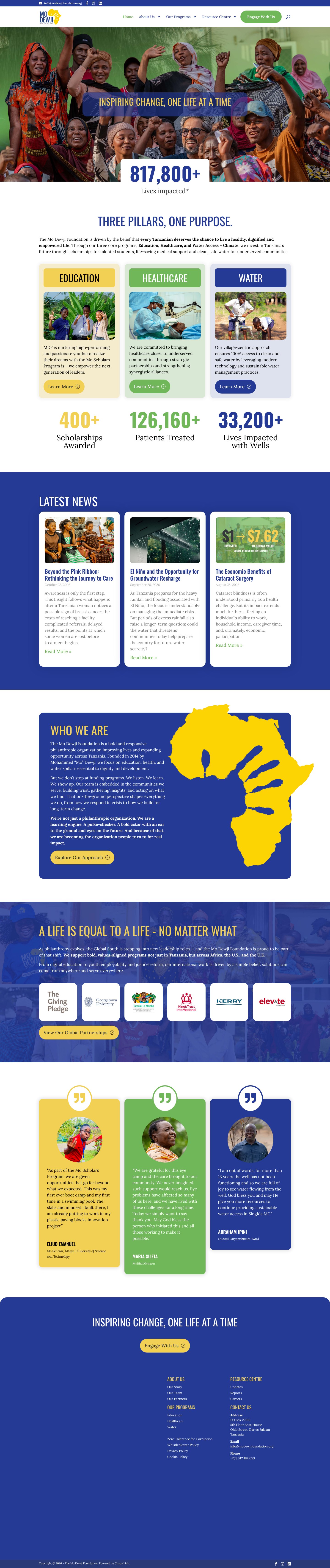
- “Three pillars, one purpose”, with cards for Education, Healthcare and Water, then three figures in a row: 400+ scholarships awarded, 126,160+ patients treated and 33,200+ lives impacted with wells.
- Latest News, with three recent articles.
- Who We Are, about the foundation and its founder.
- “A life is equal to a life, no matter what”, about the foundation’s work in Africa, the U.S. and the U.K., with partner logos.
- Quotes from Mo Scholar Eliud Emanuel, Maria Sileta of Malika in Mtwara and Abraham Ipini, ward councillor in Unyamikumbi, then the footer with the address and policies.
Everything a visitor needs is already here. The first line is the foundation’s motto, the programmes are named in the next section, and the figures sit in their own row, apart from the text about each programme.
Both pages, top to bottom
The current homepage and the redesign I proposed, at full length. Scroll inside each frame to read the whole page, then the sections below go through it one part at a time.

What visitors see first
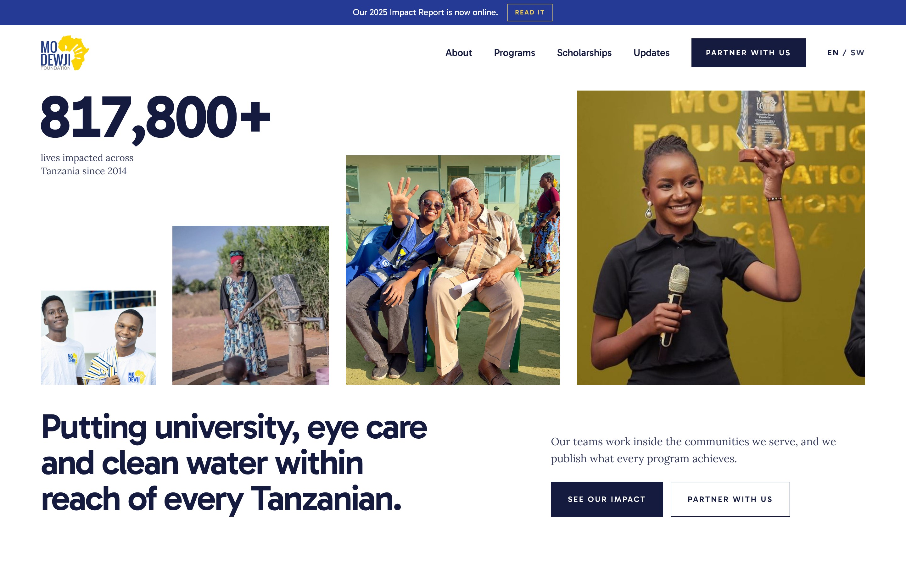
A thin blue banner at the top says “Our 2025 Impact Report is now online”, with a Read It button. A partner or journalist who came for the report finds it first.
The menu has four words: About, Programs, Scholarships and Updates. Scholarships has its own place because students come to apply, and they should not have to look for it inside another menu. One dark button, Partner With Us, sits beside the menu, with an EN / SW switch ready for a Swahili version.
The figure 817,800+ is set very large, with its label under it: “lives impacted across Tanzania since 2014”. It is the reach figure from the foundation’s own homepage. Beside it, a gallery of the foundation’s own photos moves across the screen: scholars at graduation, patients at an eye camp, a woman pumping water in Singida.
Then comes the only h1 on the page: “Putting university, eye care and clean water within reach of every Tanzanian.” It names the three programmes in words a student, a funder or a reporter could repeat. One more line says how the foundation works, “Our teams work inside the communities we serve, and we publish what every program achieves”, and two buttons follow, See Our Impact and Partner With Us.
The founder, on screen two
The second section introduces Mo Dewji with his own words, from the letter he wrote when he signed the Giving Pledge: “When God blesses you financially, don’t raise your standard of living. Raise your standard of GIVING.”
A cut-out photo of him sits beside the quote, with his name and two short facts: he started the foundation in 2014, and two years later he signed the Giving Pledge. A Read Our Story button leads to the full history. On the current homepage, his name appears in the Who We Are text, about halfway down. The foundation carries his name, so the redesign brings him up to the second screen.

One figure for each programme
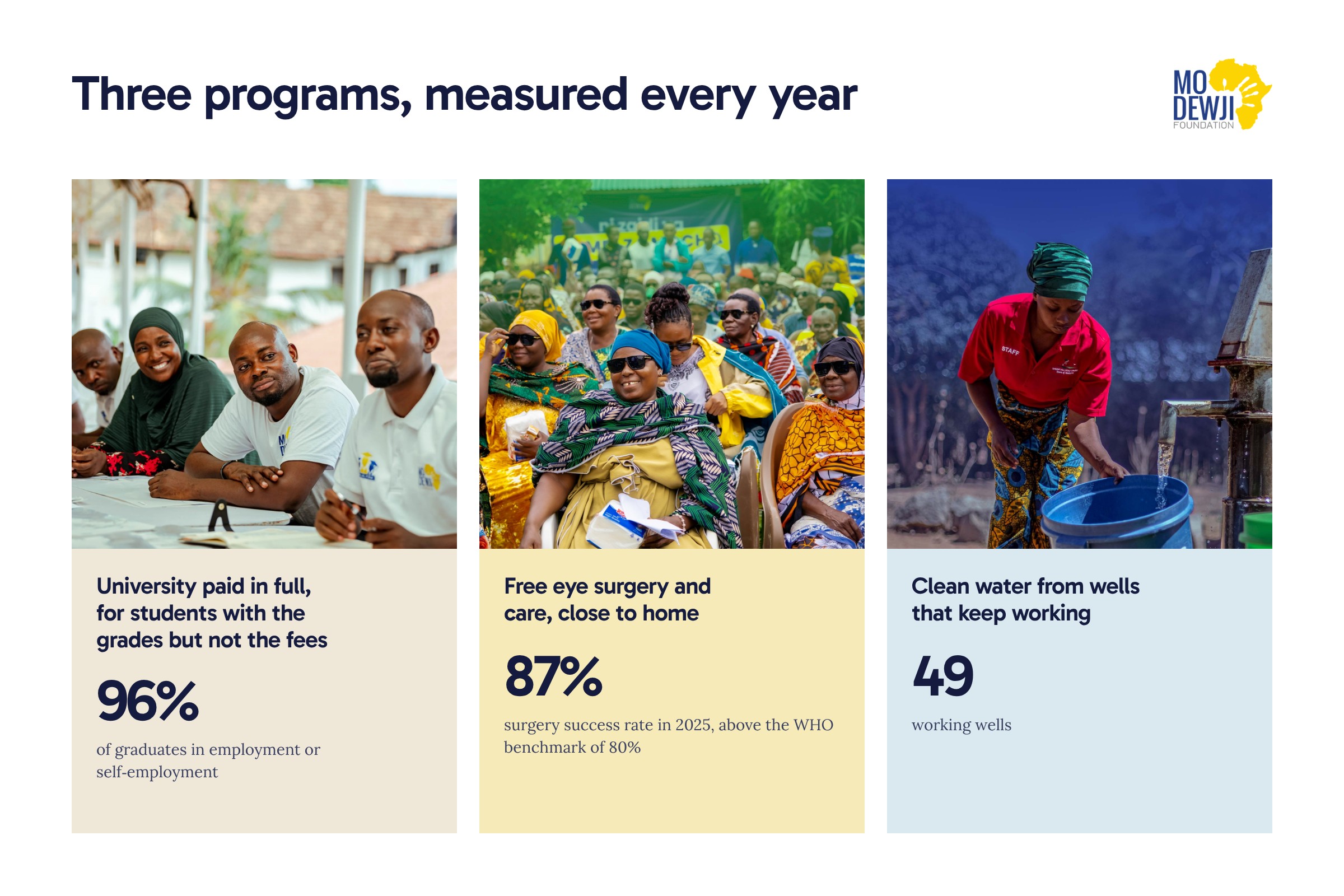
“Three programs, measured every year” gives each programme a full-width band in its own soft colour. Every band has a photo, a heading that says what the programme gives, two or three sentences, one figure and one button.
- Education: “University paid in full, for students with the grades but not the fees.” The figure reads “96% of graduates in employment or self-employment”.
- Health: eye surgery and care close to home. The figure reads “87% surgery success rate in 2025, above the WHO benchmark of 80%”.
- Water: “Clean water from wells that keep working.” The figure reads “49 working wells”.
Each figure sits next to the words about the programme it measures, and each comes from the foundation’s website or its 2025 Impact Report. I explain the method in how to show impact numbers people believe. The buttons say where they lead: The Mo Scholars Program, Health Programs and Water Projects.
Where the work happens
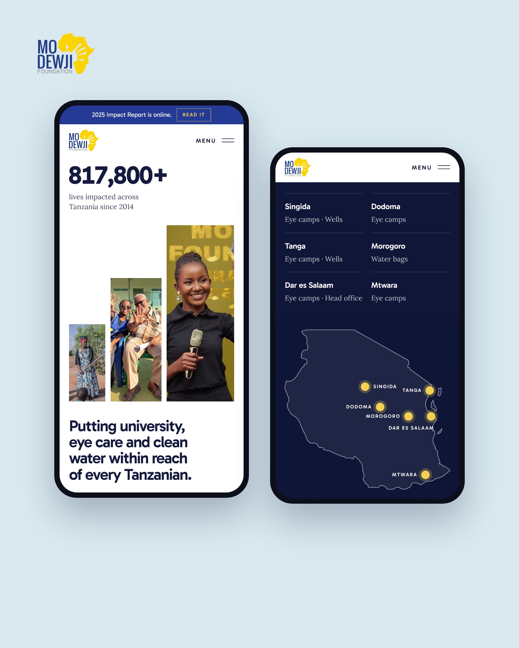
The next three sections share one dark blue background, so they read as one part of the page. “Our impact across Tanzania” opens with “Mo grew up in Singida, where many of our wells now run.” A map pins six regions, Singida, Dodoma, Tanga, Morogoro, Dar es Salaam and Mtwara, and lists the work done in each, such as eye camps, wells or water bags.
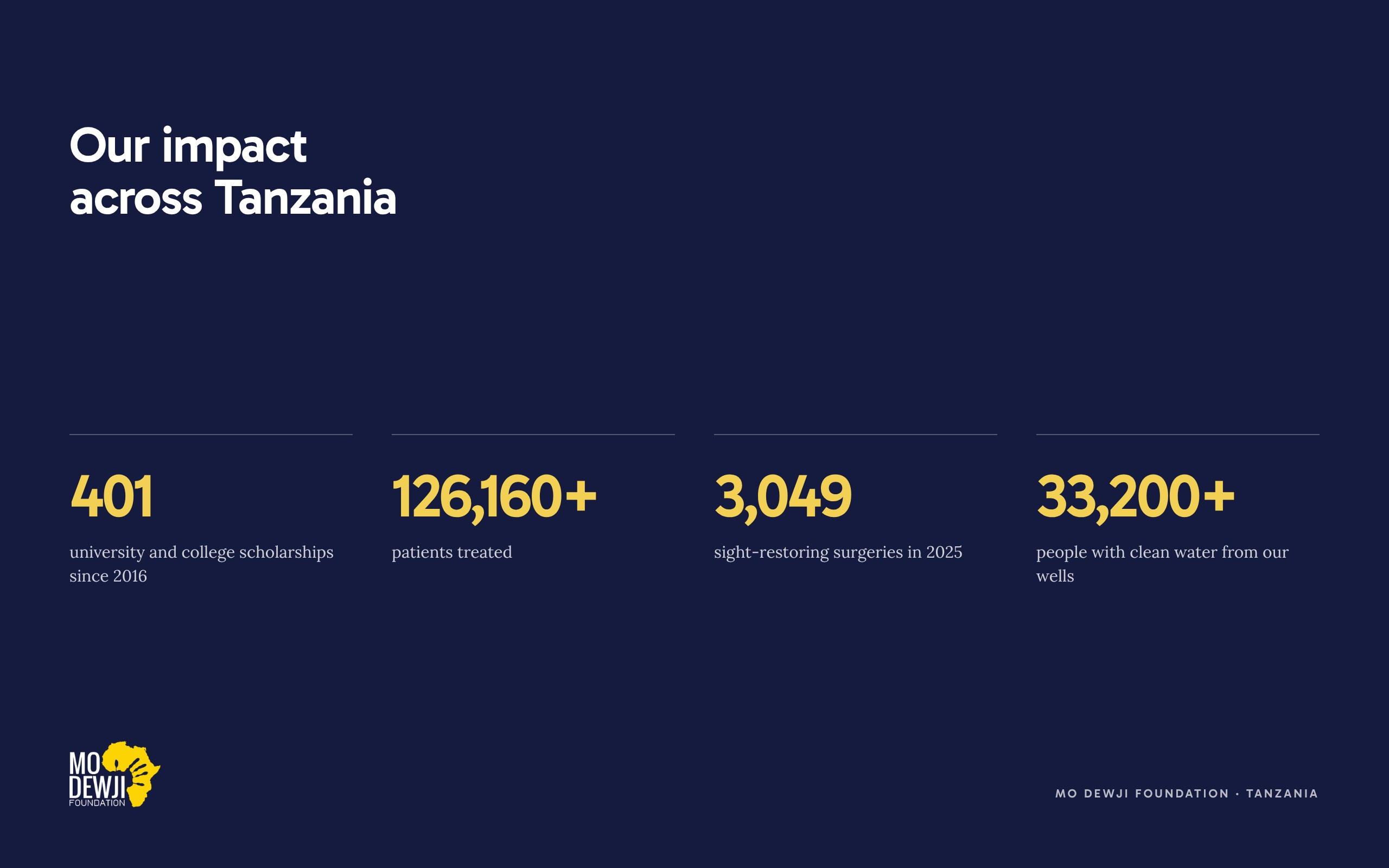
Under the map, four figures count up: 401 university and college scholarships since 2016, 126,160+ patients treated, 3,049 sight-restoring surgeries in 2025 and 33,200+ people with clean water from the foundation’s wells. A family in Mtwara can find Mtwara on the map, and a reporter can take the main figures from one place.
“Meet the scholars already giving back” shows four Mo Scholars by name, each with a photo and one line on what they do now. The fifth card invites the reader to apply: “For Tanzanian students aged 18 to 25 starting university.”

“Voices from our programs” brings in two people quoted on the current homepage. Maria Sileta, from Malika in Mtwara, speaks about an eye camp. Abraham Ipini, ward councillor in Unyamikumbi, Singida, speaks about a well that had not worked for more than 13 years. The place and the programme sit under each name.
News, reports and partners
- A yellow section offers an email newsletter with scholar stories, eye camp results and the foundation’s research on health and water.
- “Read our latest news and research” shows the three most recent articles from the foundation’s website, each with its topic and date, and an All Updates button.
- “What changed in 2025” names the 2025 Impact Report, then gives three results: 5,817 women seen through the women’s health work, 228 children supported with spina bifida and hydrocephalus, and 8,700 people with safe water storage at home. The 8,700 is the report’s figure for the SaWa bags. The foundation’s water page gives an estimate of 7,250, and the redesign follows the report.
- “Our partners in Tanzania and around the world” shows 24 partner logos, among them Muhimbili National Hospital, Tumaini La Maisha and King’s Trust International. The logos stay grey until you point at one, so the foundation’s blue and yellow stay the main colours on the page.
A next step for everyone
Near the end, “Help us reach the next family” opens with one line: “Government bodies, international trusts, Tanzanian NGOs, companies and individuals already work with us. Choose where you fit.” Three tiles follow.
- Partners can fund a scholarship, an eye camp or a well, or bring a team’s skills to a programme. The button reads Become a Partner.
- Students read who can apply and that applications open once a year. The button reads See How to Apply.
- Volunteers and job seekers can give their time, share an idea or see open roles. The button reads Get Involved.
Partner With Us also stays in the menu at the top. The page ends with a line Mo Dewji lives by, as the 2024 Impact Report puts it: “A life is equal to a life, no matter what.” The footer keeps the address, email, phone number and the foundation’s policies on privacy, cookies, whistleblowing and zero tolerance for corruption, where a partner checking the foundation will look for them.
Type, colour and the phone view
The redesign uses the foundation’s own logo, the yellow Africa shape, and its own blue and yellow, with a dark navy for headings and the main buttons. Headings are set in Gabarito, a clear sans serif, and body text in Lora, a serif. There is one h1, and every other heading keeps its correct level for screen readers. Figures count up as they come into view, and the movement switches off for visitors whose device is set to reduce motion.

On a phone, the banner shortens to “2025 Impact Report is online” and the menu becomes one Menu button. The figure stays first, and the sections stack in the same order as on a laptop. In the map section, the list of regions comes before the map, so the place names are read first. I checked the page on a small phone screen, and it does not scroll sideways.
A checklist for NGO homepages
- Put your main figure at the top, with a short line that says what it counts and since when.
- Make your h1 one sentence that says what you do, in words a partner could repeat.
- Give each programme one result from your latest report, beside the text about that programme.
- Show the regions where you work, and what you do in each one.
- Give partners, people applying for help and volunteers their own section and button.
- Keep your annual report, your policies and your contact details one click from the homepage.
- Offer the page in English and Swahili if your visitors include communities in Tanzania.
Questions about MDF’s website
Is foundation.theascend.net the Mo Dewji Foundation’s new website?
No. It is a homepage redesign I proposed for the foundation, shown on my own web address. The Mo Dewji Foundation website is modewjifoundation.org.
What does the Mo Dewji Foundation (MDF) do?
The Mo Dewji Foundation works in education, healthcare and water in Tanzania. It runs the Mo Scholars Program for university students, eye camps and other health programmes, and wells and safe water projects. Its latest results are in its 2025 Impact Report.
Who founded the Mo Dewji Foundation?
Mohammed Dewji, known as Mo, founded it in 2014, after a decade as a member of parliament for Singida. He signed the Giving Pledge in 2016, and in May 2026 he was named on the TIME100 Philanthropy list.
Where do the figures in the redesign come from?
From the foundation’s own website and its 2025 Impact Report. Each figure sits beside a line that says what it counts, such as the 87% eye surgery success rate in 2025 against the WHO benchmark of 80%.
Does a homepage redesign need new photos and new content?
Not always. The redesign I proposed for the Mo Dewji Foundation uses the foundation’s own logo, colours, photos, figures and quotes. The new work is in the order of the sections, the copywriting for the headings and buttons, the design and the build.