It is Saturday night. Someone who moved to your city last month types your church’s name into a phone. Before they go to sleep, they want to know when to come, where to park, what happens with the children and whether they will feel out of place.
If your website answers those questions in a minute, they can walk in the next morning. If the answers take ten minutes to find, it is easier to stay at home and try again another week.
This article sets out what I look for when I plan a church website, and where the best church websites in the UK, the US, Australia and Kenya get it right. The same points shaped the Ocean Church redesign I proposed for an English-speaking church in Dar es Salaam. At the end there is a checklist you can use on your own church website.
The best church websites plan for a first Sunday
A church website has many readers. Members check the time of the youth meeting, and leaders send the link to partners. But the reader with the most questions is the person who has never been, and they have no one to ask yet.
The best church websites put that person first in the menu. On North Point Community Church in Atlanta, the first item in the main menu is “I’m New”. Saddleback Church in California has a section called “New to Saddleback?” with four choices written in the visitor’s own voice, such as “I want to get baptized” and “I want to find community”.
For the Ocean Church redesign, I wrote down one visitor before I planned a single page: someone new to Dar es Salaam, checking on a phone on a Saturday whether this is a church they could walk into the next morning. The pages answer that person’s questions in the order they ask them.
Write your own visitor down before you change a page. It could be a university student, a young family or someone who stopped going to church years ago. Each of them needs a different first line.
Put the times and the place at the top
The first thing a visitor looks for is the day, the time and the place. The best church websites show them before you scroll, or very close to it.
Kerith Community Church meets in four places in the south of England, and its home page lists each one with its Sunday times and full address. All Souls Langham Place in London puts its three Sunday services, 9.30am, 11.30am and 5.30pm, on the home page. North Point shows its two Sunday times, 9:00 and 11:00 a.m., and says the service is on demand from 5:00 p.m. Hillsong Australia has locations from Sydney to Perth, so its home page leads with a church finder that can use your current location.
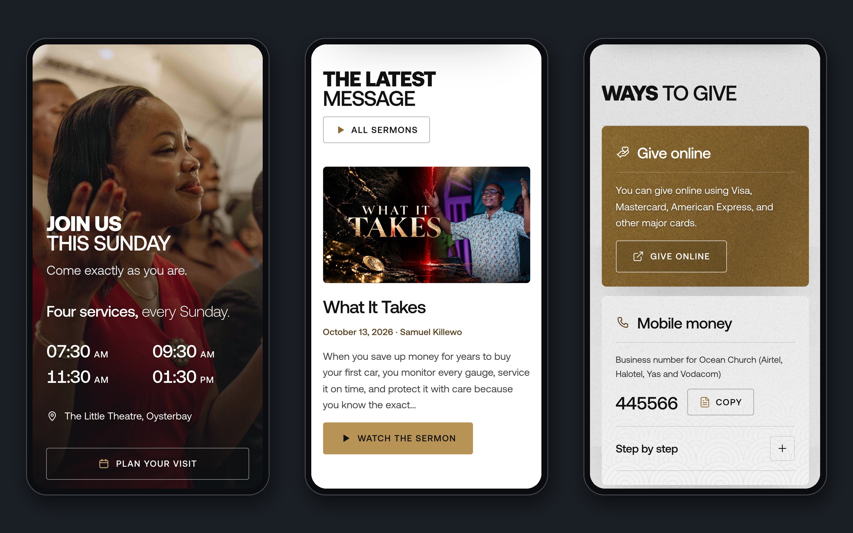
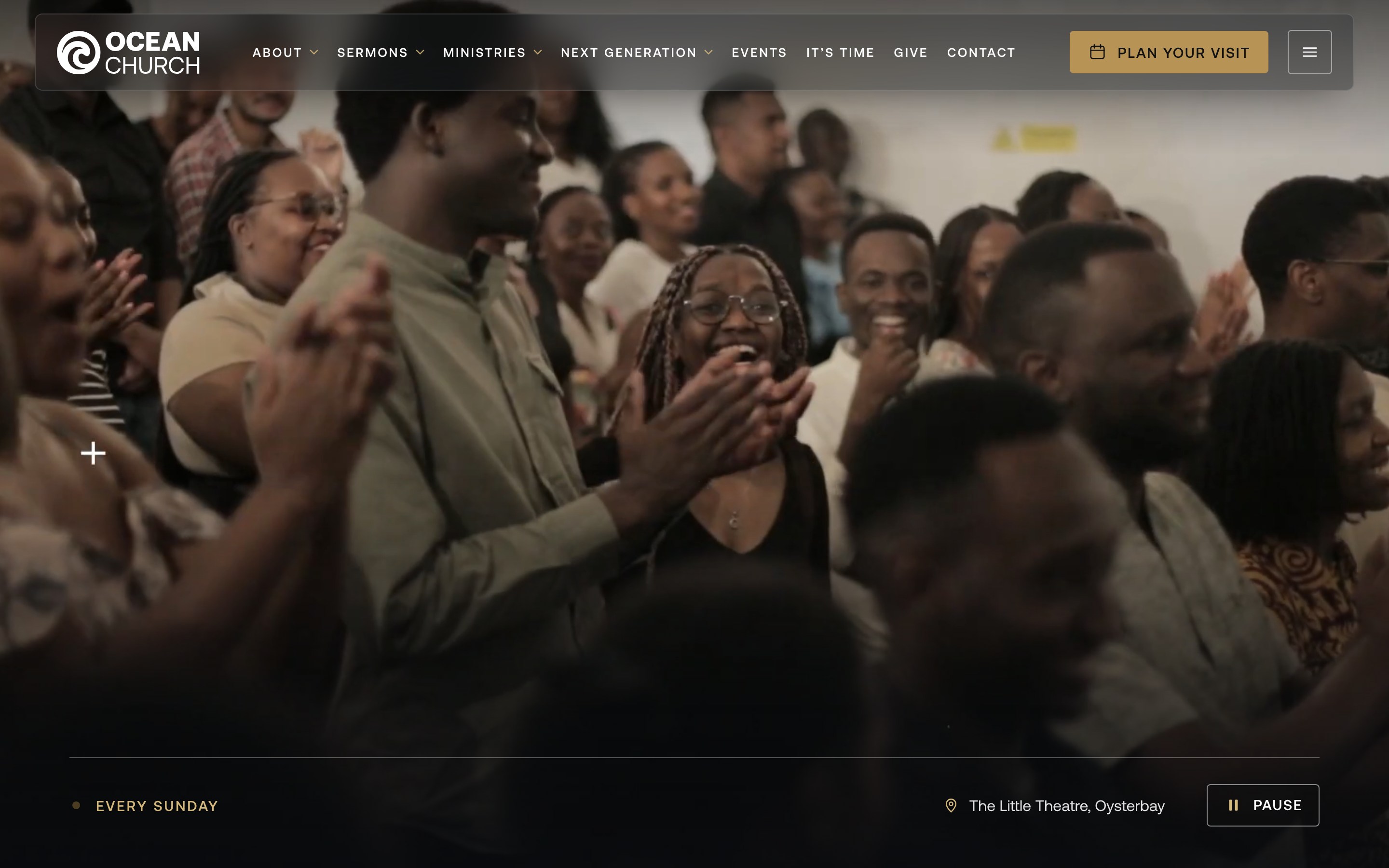
In the Ocean Church redesign, the first screen ends with “Every Sunday” and the Little Theatre in Oysterbay.
Further down, “Join us this Sunday” gives all four service times with the address. The full-screen menu shows the same times again, with a Directions button, so a visitor never has to go looking for them.

Answer the questions people feel shy to ask
Some questions a visitor will not want to put in an email. What should I wear? How long is the service? Where do I park? Is it all right to come alone? The website has to answer them before they are asked.
Hillsong Central London meets in the Dominion Theatre, and its page does this well. It gives the two service times, the theatre’s address and a link to Google Maps. Then an accessibility section explains that access hosts wait at the front doors, how the wheelchair seating works, that assistance dogs are welcome and that a few blue badge parking spaces are nearby.
Ocean Church also meets in a theatre, and its own Plan your visit page answers these questions in a warm way. It says people come in “everything from jeans and t-shirts to traditional Kitenge or suits”, that the services last about 90 minutes and are held entirely in English, and that there is secure parking inside the compound. It even tells visitors who come by Uber, Bolt or Bajaj to search for “Ocean Church” in the app.
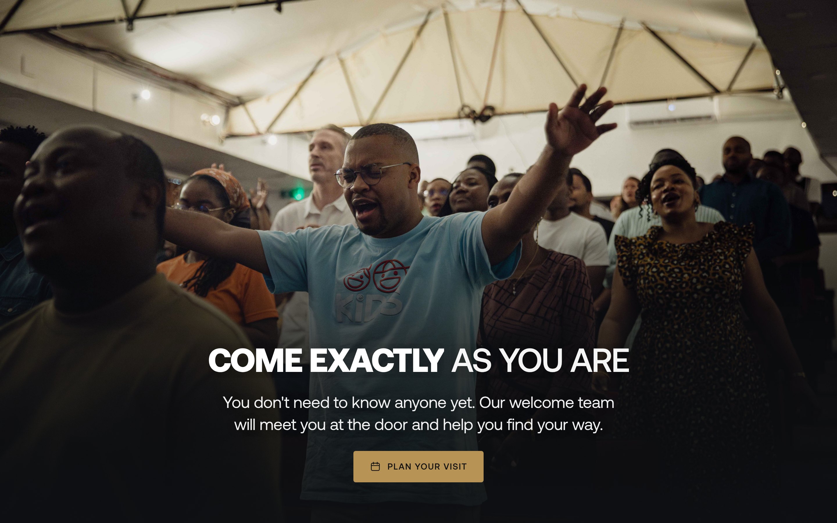
The redesign keeps those answers on its own Plan your visit page, adds a Copy the address button and a few questions people ask, and closes with “See you on Sunday”. On the home page, a short section speaks to the visitor who is nervous about coming alone:
You don’t need to know anyone yet. Our welcome team will meet you at the door and help you find your way.
If your church welcomes people who speak other languages, say so on the website too. Saddleback’s site has a language menu with five choices, from English and Spanish to Filipino and two forms of Chinese.
Tell parents what happens to their children
Parents of small children have one more question, and it is a big one. Where will my child be, who will be with them, and how do I get them back?
North Point’s home page lists what happens on a Sunday for each age, from “6 Weeks through Preschool” to “High School”, each with one short line. A parent can see at a glance that every child has a place.
Ocean Church’s current site lists its children’s classes by age, from a nursery for babies of six months to pre-teens of 13. It tells parents to look for the “Ocean Kids” sign in the lobby to check their child in. In the redesign, the Plan your visit page sets out a first Sunday in five steps, and checking children in at Ocean Kids is one of them, after parking and the welcome team at the door.

Name the age groups, say where to go and say who looks after the children. If your church has a child safety policy, link to it from the same page.
Let people hear you before they come
A sermon online lets a visitor hear the pastor before they choose a seat. The best church websites make that easy to find.
Kerith’s page for new people has a line that says “Check us out before you come”, with a link to watch church online. Elevation Church in the US offers four ways to join in: a physical campus, live streams, a Watch Party and a Pop-Up. All Souls says its sermon library holds over 6,000 Sunday and midweek recordings, going back to the 1960s.
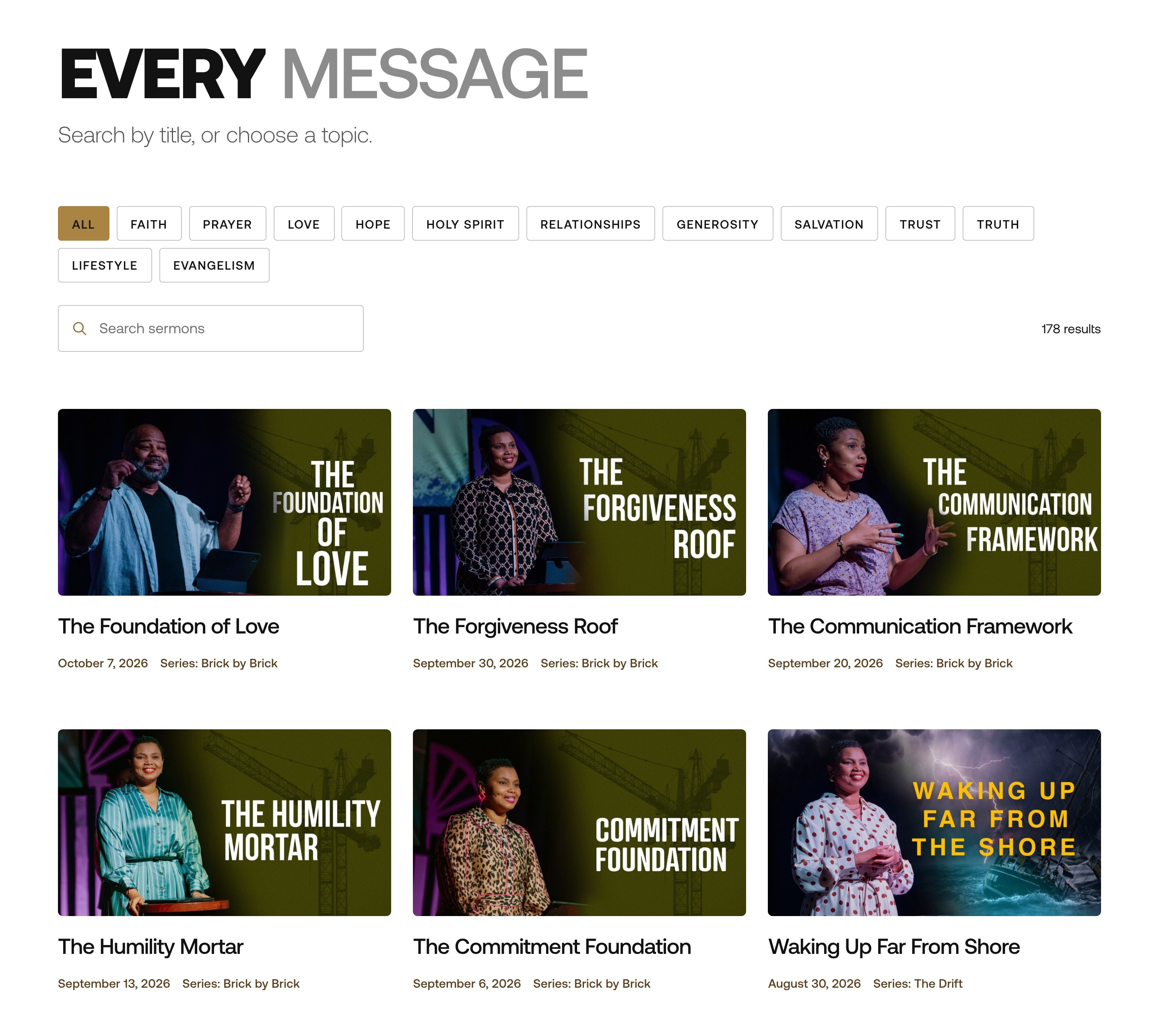
Ocean Church already has a large library of sermons on its website. In the redesign, a sermons page groups every message by series and topic, with a search. Where a sermon has a video, it plays at the top of its page, with the written notes underneath. A visitor with little data left can still read the message.
Use photos from your own Sundays
Stock photos of smiling strangers cannot show a visitor your church. Your own photos show the room and the people on a real Sunday, and they help a visitor picture themselves there.
Ocean Church keeps a large library of its own Sunday photographs. The home page of the redesign uses more than 30 of them: the welcome team at the door, the band, a baptism, friends laughing after the service.
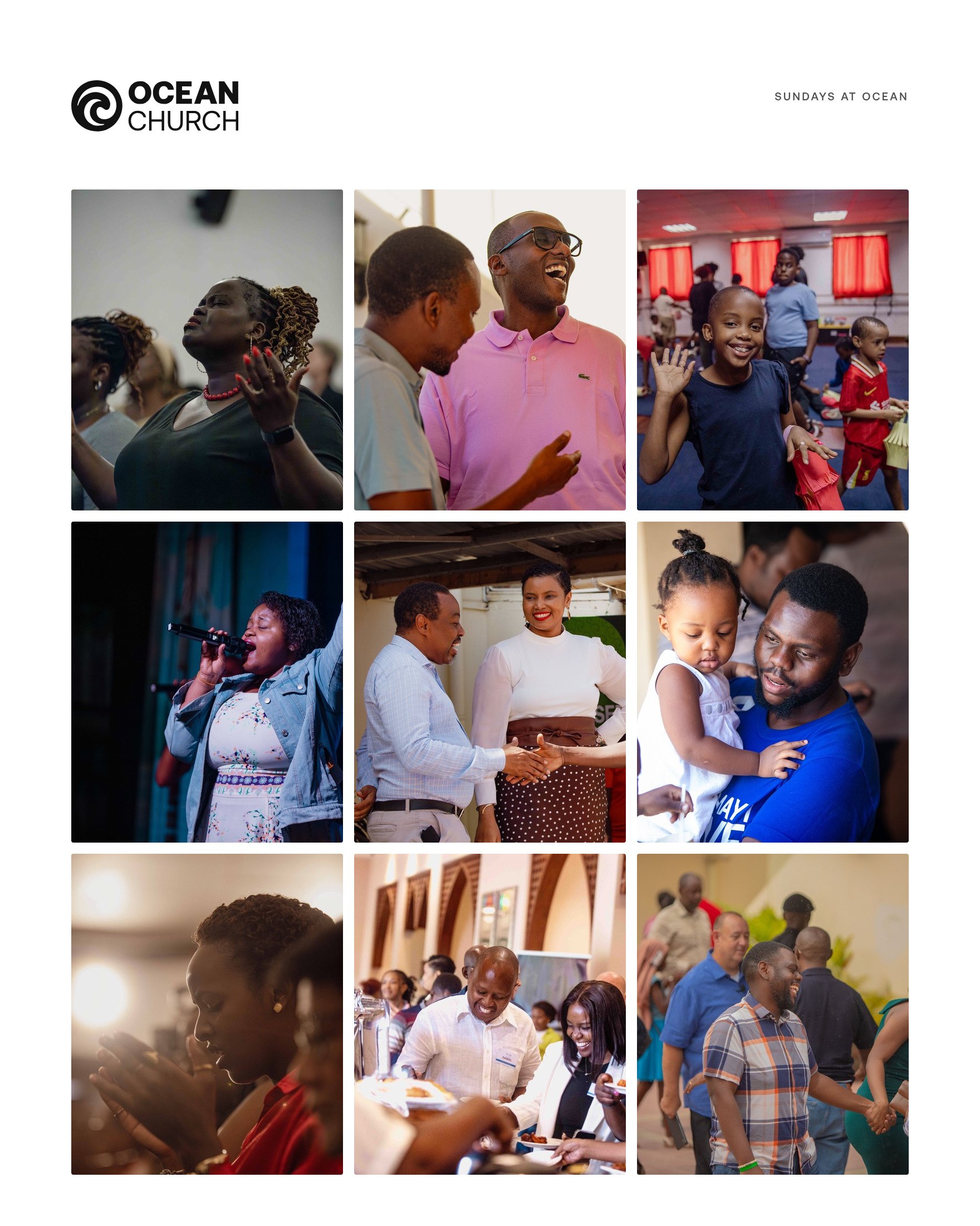
If someone in your church takes photos on Sundays, ask them for wide shots of the room, close shots of faces (with permission) and the moments before and after the service. Those are the moments a newcomer wants to see.
Make the next step easy on a phone
A button that names the action tells a visitor what happens when they tap it. Plan your visit, Watch the sermon and Find a group each say exactly that.
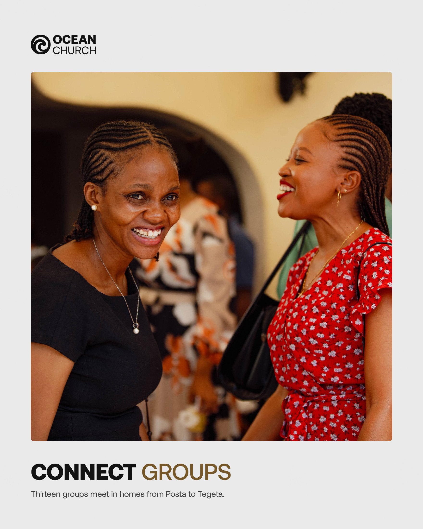
In the Ocean Church redesign, each page closes with one next step, and each button says what it does. Small groups get the same care. Thirteen connect groups meet in homes from Posta to Tegeta, and the events section shows the number of groups, the days they meet and a Find a group button.
Giving is a next step too. It should take a minute, and it should work the way your members already pay. In Kenya and Tanzania, that includes mobile money. Nairobi Chapel puts its M-Pesa Paybill number on its home page, with its bank details and a WhatsApp number. Ocean Church’s Give page lists four ways to give: bank transfer, Selcom, a mobile money till for Airtel, Halotel, Yas and Vodacom, and cards online.

Show the numbers as text a person can copy, say which name will appear on the payment screen, and keep the page short. Someone giving for the first time wants to be sure the money reaches the church. For more on mobile money, data and WhatsApp, see what to put on a church website in Africa.
A checklist for your church website
Open your church website on your phone and check these points, one by one:
- The day, the times and the place are on the first screen, or one short scroll below it.
- The address opens in a map app, with a line on parking or how to arrive by taxi or ride-hailing app.
- One page tells a first-time visitor what happens on a Sunday, from the door to the end of the service.
- The service length, the language and what people wear are written down.
- Each children’s group has its age range, and parents know where to check in.
- The latest sermon is one tap from the home page, and older sermons are grouped by series.
- The photos come from your own Sundays.
- Every button says what it does.
- Giving takes a minute on a phone, with the numbers as text a person can copy.
- Past events are gone from the home page and the menu.
- When a service time changes, you change it once and every page shows the new time.
To see how these points work on one church website, read the church website redesign I proposed for Ocean Church. If your church welcomes people who are new to the city, read how to reach English speakers in Dar es Salaam.
Short answers for church leaders
What should be on the home page of a church website?
The service times, the address with a map link, one line that says who the church is for and a button to plan a first visit. After that, the latest sermon, what happens for children, small groups and a way to give. Kerith Community Church and All Souls Langham Place both put their Sunday times on the home page.
What makes a church website good?
It answers a newcomer’s questions in the order they ask them: when and where, what a Sunday is like, what happens with the children and who leads the church. It uses the church’s own photos, it works well on a phone and every button says what it does.
Does a church website need a Plan your visit page?
Yes, if you want new people to come. It is the one page that walks a visitor through a first Sunday: parking, the door, the children, the service and what to do next. Hillsong Central London and Ocean Church both have one.
How should a church put its sermons online?
Give each sermon its own page with the title, the date, the speaker and the series. Put the video or audio at the top and the notes underneath, and group older sermons by series and topic with a search, so a visitor can find a subject that speaks to them.
How long does a church website take to design and build?
From 7 days for a website of about 5 pages. Blogs and big redesigns take from 2 weeks. The time starts once your notes, logo, photos and the deposit are in.
Can our church team update the website after it goes live?
Yes. The websites I build are on WordPress and set up in your name. At handover you get a short video showing the everyday edits on your own site, such as service times, sermons and events.