
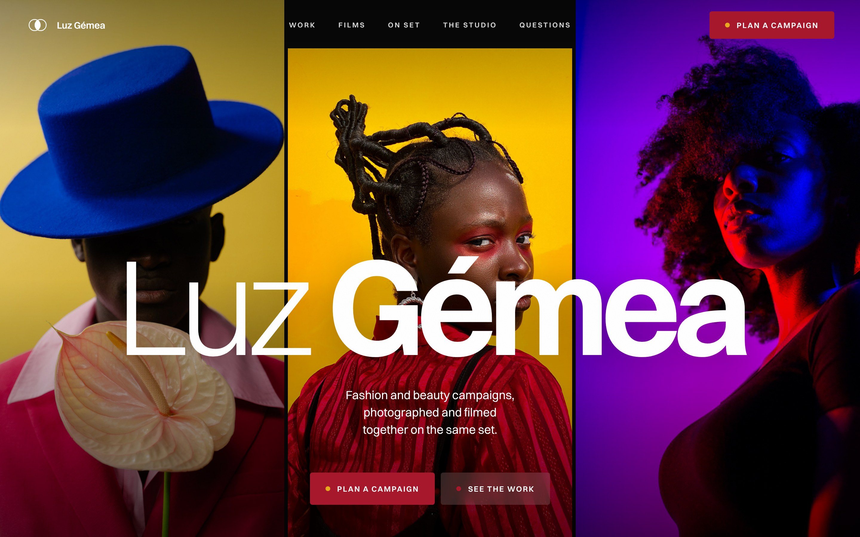
If you run a campaign studio, a production company or a photography studio, your website is the first piece of your work a brand sees. Its colours, its type and the order of its sections tell a brand manager about your taste before she reads a word. I directed the Luz Gémea website so that each of those choices tells a fashion label it can trust the studio with its next launch.
Luz Gémea is a campaign studio brand and website I created. It is set in Santos, Lisbon, and it photographs and films campaigns for fashion and beauty labels. The director, Duarte Valadas, runs the photographer and the film crew together, so the photographs and the films of a campaign match. I made the brand and the website as one piece of work, from the idea to the last button.
Below are the decisions I made and the reason for each one, with a checklist at the end for your own studio website.
Start from what the name means
Luz Gémea means twin light in Portuguese. On the website, one line explains it: “The same crew lights the photographs and the films, so nothing in your campaign looks borrowed from another shoot.”
Before I drew anything, I wrote down who the website is for. She is the head of brand or creative director at a fashion or beauty label, planning next season. She has one budget, one launch date and a social team asking for content every week. Her fear is a campaign with photographs and a film that do not match.
Twin light answers that fear, so it became the test for every choice. Each colour, each section and each movement on the page had to show or explain it, or it was left out. Near the top of the page, the director’s note speaks straight to her:
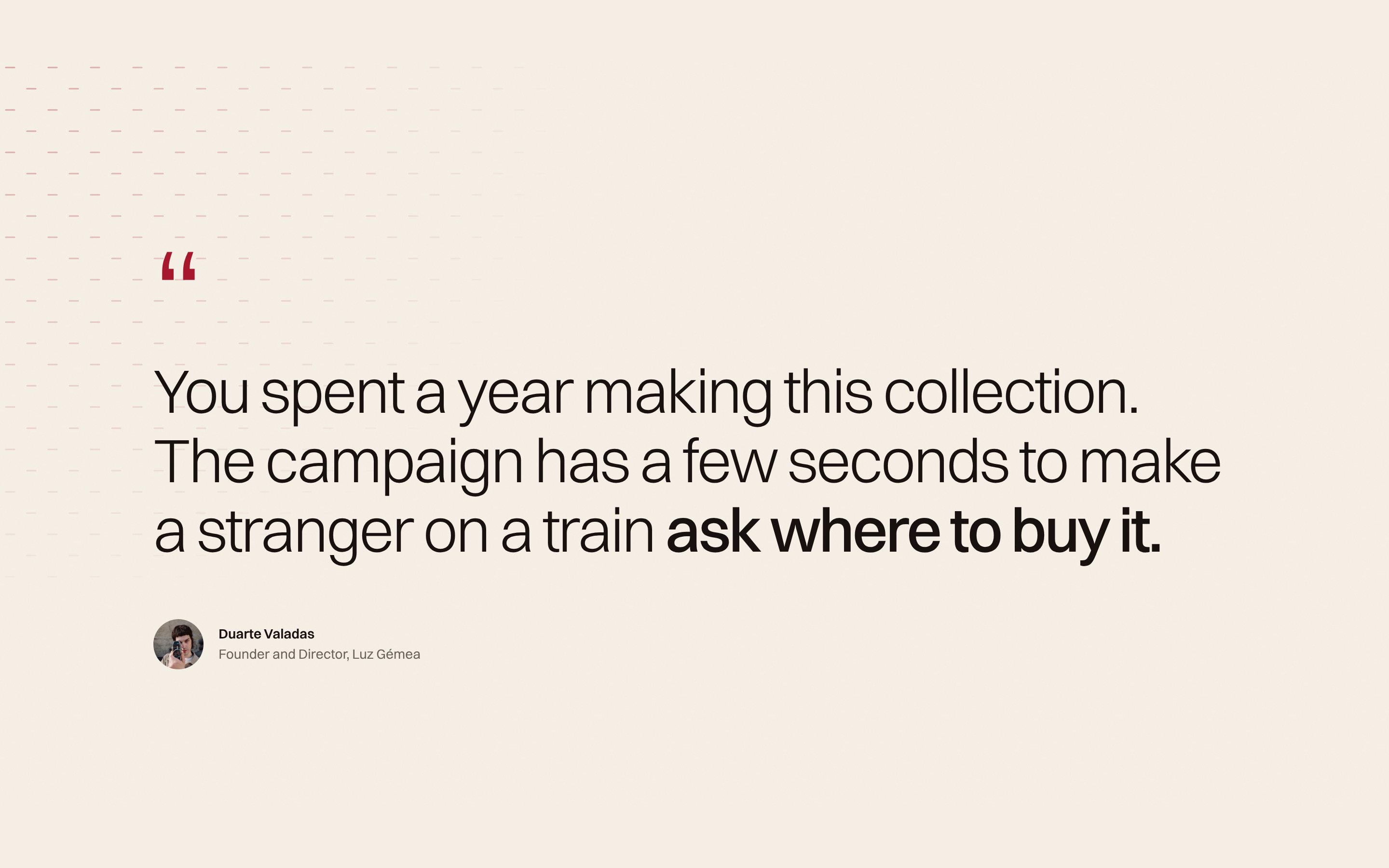
You spent a year making this collection. The campaign has a few seconds to make a stranger on a train ask where to buy it.
Colours taken from the shoots
Each colour on the page comes from a campaign photograph: the yellow anthurium wall, the blue hat, the lacquer-red suit, the violet light and the pink suit.
- Red, for the main buttons and the key words in headings.
- Cobalt, for how a shoot runs.
- Violet, for the director’s story.
- Yellow, for the last message to the studio.
- Rose, for small moments only.
- Ink, for text and the films, with bone and sand for the page itself.
The bright shades stay in the photographs. For the large blocks of colour, I used deeper and calmer versions, so a block never fights the picture on it. Cobalt, violet and yellow each fill a whole section. Red is the one colour kept small, on buttons and key words, so the eye goes to the action. Each heading has one coloured phrase at most.

For your own studio, open your ten best photographs side by side and pick your colours from them. Your website will then look like your work.
One typeface and a two-ring mark
I wanted one family wide enough to carry both the quiet text and the loud headings, so everything on the page is set in Switzer, a typeface from the Indian Type Foundry’s Fontshare library. I used the whole family, from Thin to Black, and the font files are hosted with the website.
Headings mix a light weight with a bold one, as in “Your campaign, in motion”, so the bold words are read first. The wordmark follows the same rule, with “Luz” in a light weight and “Gémea” in semibold. On the first screen, the studio’s name is sized to fill the width of any screen, so no letter is ever cut.

The mark is two rings that cross, with the space where they overlap filled in. Two lights on one set meet in the middle, and that shared part is what the studio sells. I tested it on every ground in the palette, red, cobalt, yellow, violet, ink and bone, and changed the fill colour so it reads on each one.
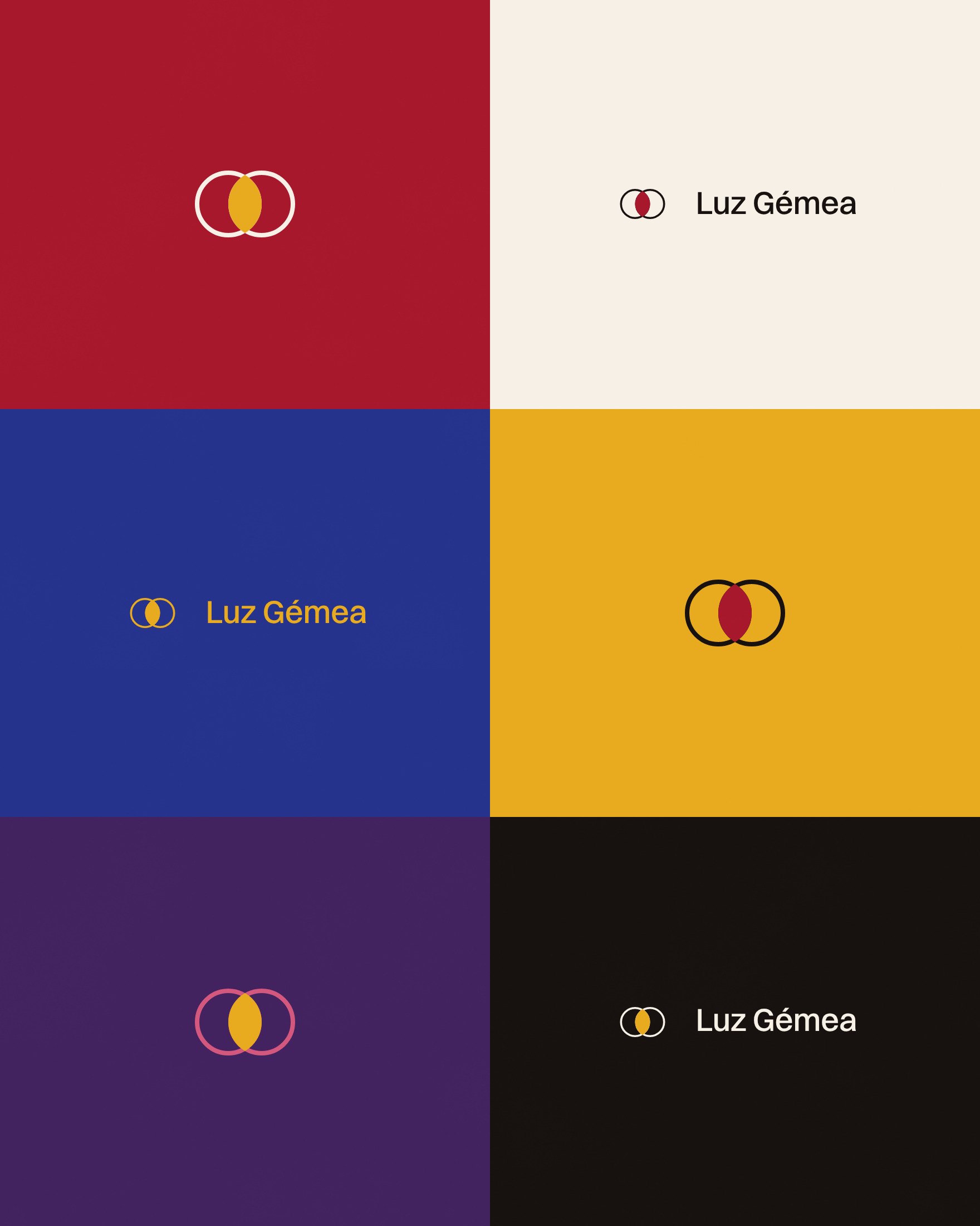
Repeated in rows, the rings become a pattern in four of the brand colours. On the website, they appear once more, large and in outline, behind the last message to the studio.
The Luz Gémea website follows her questions
Luz Gémea is one long page. I set the sections in the order a brand manager asks her questions, and each section answers one of them:
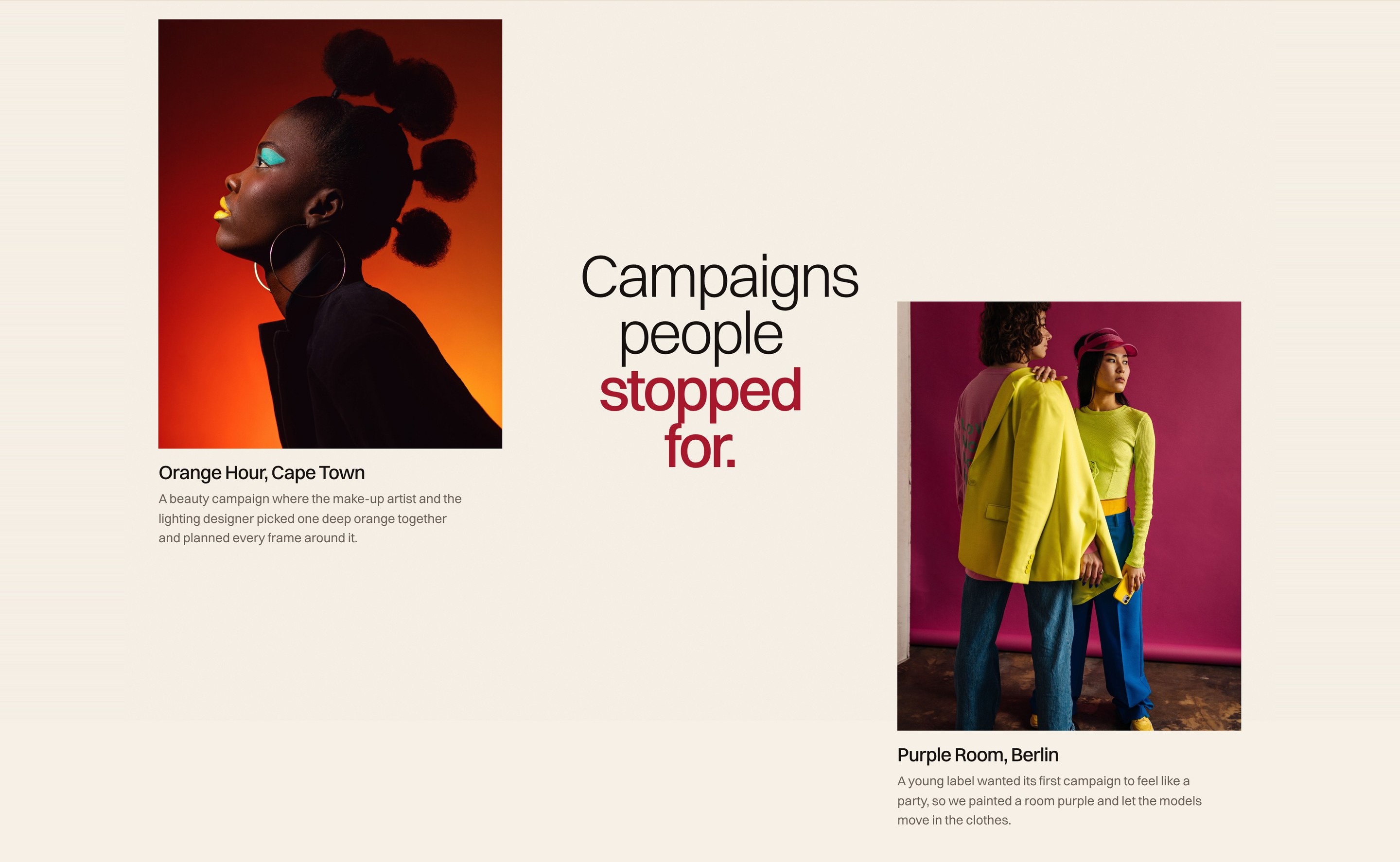
- Is the work good enough for our label? “Campaigns people stopped for” shows six campaigns from six cities.
- Will the films look like the photographs? “Your campaign, in motion” shows four films from the same shoots.
- What happens after our first call? “From your first call to the final file” gives four steps with their timings.
- Who owns the pictures, and what does it cost? “What brands ask first” answers the five questions brands ask first, including who owns the images.
In full, the order is the opening, the director’s note, the five services, the work, the films, the shoot, the numbers, the director’s story, the studio to book by the day, the questions and the contact section. The menu uses the same plain names: Work, Films, On set, The studio and Questions. After the first screen the header turns white, and it hides while you scroll down so the photographs have the whole screen.
If you want this order for your own studio, my article on what an art director’s website needs explains each part and how the strongest studios handle it.
Motion that helps her read
Every movement on the page has a job. If I could not say what it helped the visitor see or read, I took it out.
- The three campaigns on the first screen drift slowly as the page scrolls, which gives the opening depth without hiding the photographs.
- On a computer, each service in the list shows a photo of that kind of work beside the pointer. On a phone, the list stays plain and quick to read.
- The director’s note starts pale and darkens word by word as you scroll. The bold end, “ask where to buy it”, fills in last.
- In the campaigns, the title holds the centre while large photographs pass at two speeds.
- In the steps of a shoot, the photo holds still while the steps scroll past and change it, from the treatment to delivery.
The films are muted and loop, and they play only while they are on screen, so a phone never plays four films at once. I graded them for depth, with more contrast and colour, so they sit next to the photographs without looking like a different shoot. On a phone, you swipe from one film to the next.
If a phone or computer is set to reduce motion, everything on the page shows at once, with no animation. The website reads the device’s reduced motion setting to do this. I built the whole page by hand in HTML, CSS and JavaScript.
Copy a brand can check
A brand manager reads a studio’s website the way she reads a quote, looking for anything she can hold the studio to. So I wrote the copy to one person, using “you” and “your collection”, and I gave her facts in place of praise.
The numbers each come with a line on what they mean: 2014, the year the studio opened, 48 hours from the last shot to the first selects, 31 countries and “12 campaigns a year, so Duarte can direct every one himself”. Each campaign has one specific detail. Under Anthurium, Lisbon: “The flower is now stitched inside every jacket.”
The print advert speaks to the same person: “You spent a year making this collection. The campaign has a few seconds to make a stranger on a train ask where to buy it.”

The services say what each one does for the brand. Beauty and fragrance reads: “Close-ups of skin and perfume glass, lit so the shade on screen is the shade she takes home.” The price question gets a straight answer about what the price depends on: the days on location, the size of the crew and the usage.
I also decided what to leave out. Words such as “iconic” are not on the page, and neither are awards the studio does not have.
One message to the studio
“Plan a campaign” sits in the header on every screen. It opens one WhatsApp message to the studio, with no long form to fill in, so a brand manager can write from her phone between meetings.
The page ends on the yellow section, with the two rings in outline. It asks for the two facts the studio needs first, “Tell us about your next collection, and when it goes on sale”, and gives the studio’s place, Santos, Lisbon, and its hours, Monday to Friday.
Photographers who only want the empty studio for a day are a different visitor with a different question. They get their own button, “Ask about a date”, beside the 400 square metres of daylight, the white cyclorama, the make-up room and the kitchen.

Take these choices to your site
You can use the same decisions on your own studio website:
- Write one sentence about what makes your studio different, and test every section against it.
- Take your colours from your best photographs. Give the calmer ones whole sections, and keep the strongest one small, for buttons and key words.
- Use one typeface, with a light and a bold weight in your headings.
- Make a mark that means something about how you work, and test it on every colour you use.
- Set your sections in the order a brand asks her questions.
- Give each movement a job, play films only on screen, and respect the reduced motion setting.
- Write facts a brand can check, and leave out praise you cannot prove.
- Give each kind of visitor one clear way to reach you.
Short answers on Luz Gémea
What does Luz Gémea mean?
Luz Gémea means twin light in Portuguese. In the brand, it stands for the same crew lighting the photographs and the films of a campaign, so they look like one shoot. The two-ring mark shows the same idea.
What makes a good campaign studio website?
It shows the campaigns first, then the films, how a shoot runs with real timings, who directs, how usage rights work and one way to get in touch. My article on what an art director’s website needs goes through each part.
Which typeface does the Luz Gémea website use?
Switzer, from the Indian Type Foundry’s Fontshare library, in weights from Thin to Black. Headings mix a light weight with a bold one, so the bold words are read first.
Why is the Luz Gémea website one page?
A studio with one director and one way of working can answer the questions a brand asks first on one page. The sections follow the order of her questions, from the work to the films, the shoot, the studio and the price. A bigger studio with many directors or services may need more pages.
Does the motion on the website work on phones?
Yes. On a phone the services list stays plain, the films sit in a row you swipe and they play only while on screen. If the phone is set to reduce motion, everything shows at once without animation.

